To build a strong, recognizable brand, you need everyone in your business to present a consistent brand identity to your customers and the market. Brand guidelines are more than just rules—they are the heartbeat of a brand’s identity. They encapsulate the emotions, values, and vision that breathe life into a brand, ensuring every interaction resonates with its true essence.
By following these guidelines, brands maintain consistency and evoke emotions that forge deep connections with their audience. This emotional resonance turns casual customers into loyal advocates, keeping the brand’s spirit alive at every touchpoint. In this article, I will provide helpful information on creating brand guidelines for optimal effectiveness in representing your brand.
Key Points
- Brand guidelines are rules that companies can use to generate a consistent public image and voice within their marketing materials.
- Creating a consistent brand identity requires comprehensive and accessible brand guidelines regularly updated and followed by all teams.
- Following brand guidelines helps maintain consistency, crucial for building emotional connections with the audience. This connection can turn casual customers into loyal advocates.
- Practical brand guidelines should cover the brand core (values, mission, vision), logo usage rules, specific colour palettes, imagery guidelines, and a clear tone of voice. These components ensure consistency and help maintain a coherent brand identity across all communications and designs.
What Are the Brand Guidelines of a Company?
Brand guidelines are rules that companies can use to generate a consistent public image and voice within their marketing materials. They help teams achieve consistency by detailing how your brand should look, act, and sound. They include your company’s mission statement and core values and explain how to use visual and written elements to express your brand identity in your content.
Many companies initially document their brand guidelines in PDFs. However, as the business grows and its brand evolves, employees find it hard to maintain and update the files to ensure everyone works from the latest version.
When branding becomes a priority, companies often switch to an online platform to host their guidelines instead. Because online guidelines are a centralized home for your brand, any changes are automatically reflected for all employees, so everyone always has access to the latest information.
What Needs to Be Included in a Brand Style Guide?
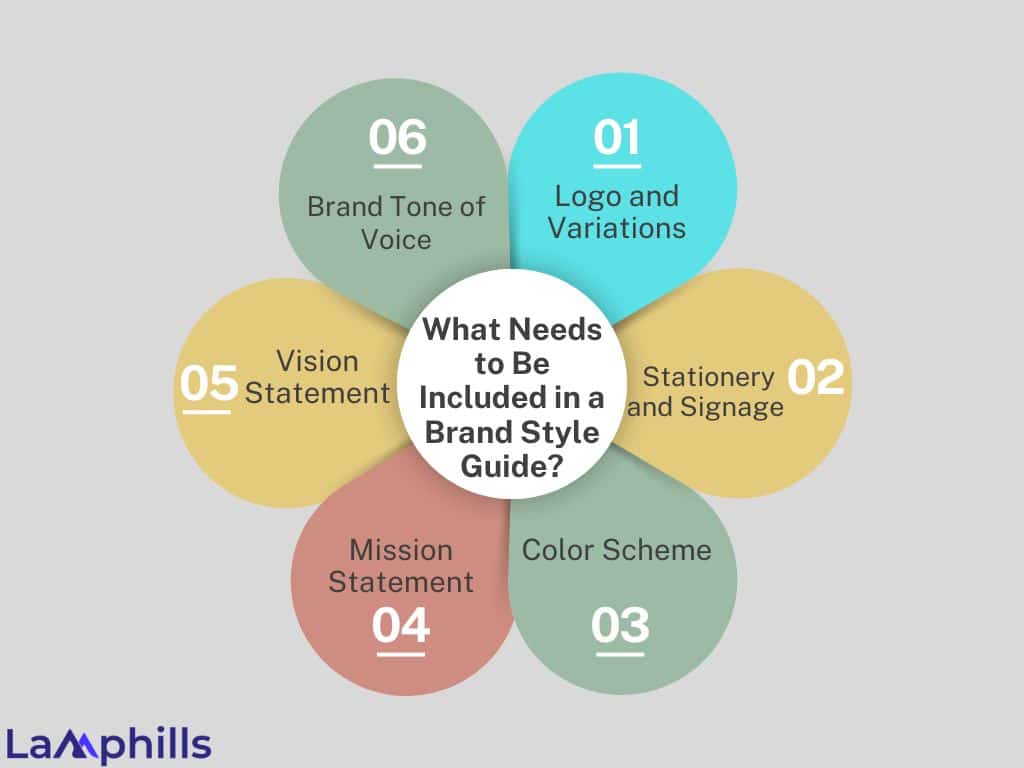
Typical brand guidelines include fundamental components incorporating the brand voice and crucial visual design elements. Depending on the requirements of a project, brand guidelines can range from a simple overview of approved fonts, logos, and colours to an in-depth guide on all aspects of a company’s marketing and image. Consider the primary function of your brand guidelines to determine which sections are most important to include. Some of the common parts included in brand guidelines are:
#1. Logo and Variations
Your logo is a fundamental element of your brand identity, so it’s essential to describe it in your brand guidelines. If your brand allows designers to change parts of the logo, provide specific instructions on what aspects they can change and what elements they’re required to keep the same.
#2. Stationery and Signage
Your branding extends to anything with the business name on it, including letterhead and business cards. List instructions for creating physical signs for the business and what branding elements you and your team want to be included.
#3. Color Scheme
Include the significant hues utilized in your website, text, and logo. Also, include a supplementary colour palette that gives your material more visual interest. Print materials such as leaflets and signage can all benefit from secondary colours.
#4. Mission Statement
Some brand guidelines include a mission statement summarizing a company’s goals and values. Remember your mission statement when building your brand identity to ensure your materials reflect the correct message.
Read also: Incorporating Mission Statements into Branding: A Comprehensive Guide for Businesses
#5. Vision Statement
Whereas the mission statement focuses on the present, the vision statement looks to the future, outlining what the brand aspires to become or achieve. It illustrates the brand’s long-term aspirations, inspiring and motivating stakeholders to strive toward this shared dream.
#6. Brand Tone of Voice
Guidelines often neglect voice and tone, as many companies focus on the visual aspects of their brand identity. However, how you write and speak is as crucial for building recognition as your brand’s appearance.
Documenting your brand voice in your guidelines will ensure your written, audio, and video content achieves a consistent voice and style. The tone of voice guidelines help your team adopt a consistent brand voice, regardless of whether it’s a campaign from your marketing team or a ticket response from customer support.
Read more: TONE OF VOICE: What It Is, Why It Matters, and How to Define Your Brand Voice
Practical brand guidelines can be shared and understood easily by anyone involved in communicating your brand—internally and externally. That’s why they should be concise, easy to read, and digitally accessible.
Why Brand Guidelines Matter?
Creating an attractive Instagram grid is always a plus, but following a brand guide can help you do far more than become follow-worthy. I’m talking about measurable results that can make any boss happy (especially if you are your boss).
Here are four of the many reasons why brand guidelines are essential:
#1. Your Team Will Work Faster
If you love a tool that does half the work, you will love a brand style guide. Setting brand identity guidelines makes it easy to steer your marketing efforts in the right direction before ideation starts.
These brand guidelines can assist you in eliminating ideas that are deemed “wrong” and reducing your list of viable possibilities throughout the brainstorming process, all without provoking a disagreement with your teammates. You and your team win together, decision-making is accelerated, and there is no physical altercation.
#2. Your Company Becomes More Recognizable
Every business has its brands, some significantly more distinct than others. If your brand isn’t clear, you will ultimately be characterized by your product or service, which won’t leave the best possible impression.
Brand guidelines help you combine all the elements that make up who you are to build an identity beyond what you sell. Your customers can visualize what you stand for when they hear your name.
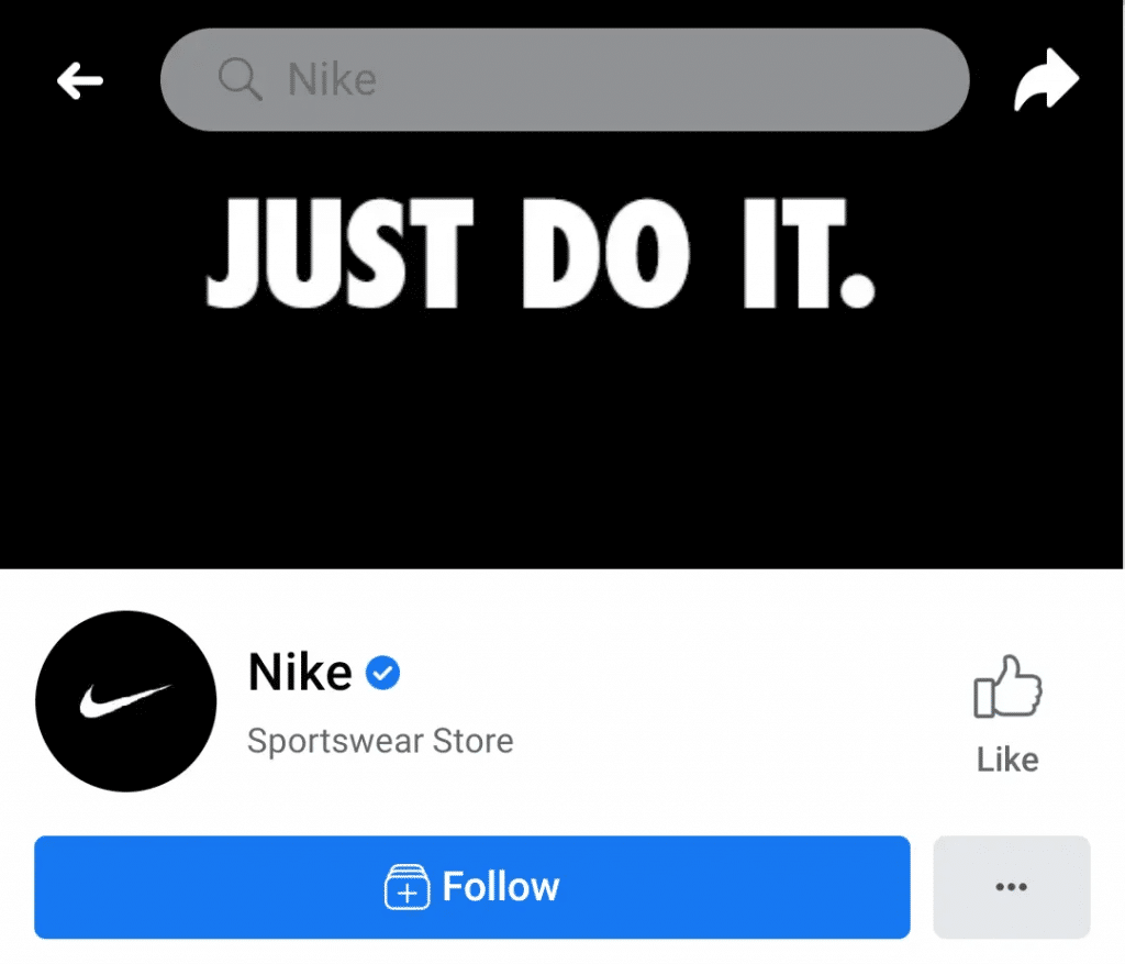
Think of Nike, for example. Just look at its iconic swoosh and inspirational tagline on Facebook, and you know what business page it is.
As we continue to live online, having a concrete visual identity is more important than ever. The relevance of image search is rising, which means people are discovering brands on search engines through visuals alone.
To boost your image SEO, you must use high-quality, wholly unique, branded templates that people want to share. As your visuals get more engagement and shares—especially on keyword-rich platforms like Pinterest—your recognizable brand visuals will rise on image search and your website.
#3. Great Branding Boosts Loyalty
When people become loyal customers, it’s usually not just because of a product or service. Think about ridesharing companies, for example. Uber and Lyft provide nearly identical services—often sharing the same drivers—and yet many users have a preference. Branding plays a vital role.
Consumers develop emotional connections with companies that share the same core values, and your brand guidelines help you uniquely translate those values to your audience. When you gain a loyal customer, they’ll spend 67% more than new buyers.
#4. You’ll Be Distinguished From Others
Most of us spend a lot of time online, and when you do, the numerous content marketing opportunities can begin to look the same. However, if you consistently promote a consistent brand, your audience will eventually pay attention at least once.
A consistent brand voice has made Wendy’s tweets go viral countless times. Audience members have come to expect the brand to have the best comebacks for just about any situation.

Whether you commit to a sassy brand personality or a friendlier tone of voice, staying within your brand guidelines can help you boost brand awareness and become a brand that people can’t wait to hear from.
How to Create Brand Guidelines
While there are different ways to create brand guidelines, organizations should ensure certain information is provided in their policies or style guides. For branding guidelines to be practical, they require consistent application throughout your organization. Creating your style guide must be easy to access, read, and apply and include links to the other digital branding assets its users need.
Below is a comprehensive checklist guide to creating a compelling set of brand guidelines for your business:
How to Create a Brand Guidelines Checklist
Brand Guideline Examples
Here are a few notable examples of brand guidelines from various companies, each known for their comprehensive and visually engaging approach:
#1. Duolingo
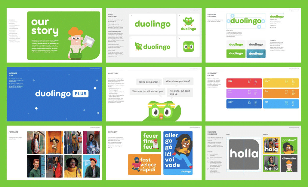
Duolingo’s brand guidelines signify the essence of its brand – fun, educational, and approachable.
The Duolingo logo, a playful representation of a green owl, is instantly recognizable and represents the brand’s commitment to making language learning enjoyable. The green logo reinforces the brand’s commitment to nurturing growth and progress.
Duolingo’s owl mascot, Duo, adds a human touch to the brand identity, making it more relatable and fun. The sans-serif font choice aligns with the brand’s ethos of simplicity and accessibility. It emphasizes making language learning easy!
#2. NASA
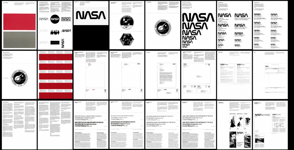
In 1976, the National Aeronautics and Space Administration (NASA) released a new logo and a 60-page manual detailing how to use it on everything from letterhead to cars.
It also includes NASA’s brand fonts (Helvetica, Futura, Garamond, and Times Roman) and the intention behind each. For example, “The precision letterforms [of Futura] have a technological character and make it a natural for certain NASA projects.”
Your brand guide might not be as long as NASA’s and probably won’t include specifications for using your logo on spacecraft, but it’s still a classic brand guide example. “NASA is kind of idolized,” Ky says.
#3. Spotify
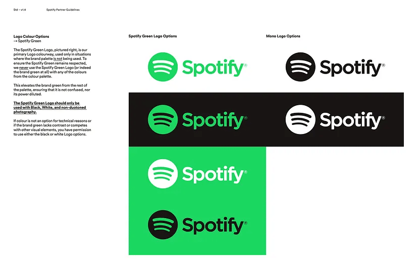
Spotify’s visuals provided a vibrant, engaging experience that mirrored its users’ evolving musical tastes. The bold shift towards duotone colours and contemporary design elements resonated particularly well with millennials, who appreciate visually stimulating and experiential design.
However, Spotify didn’t make minor adjustments to its aesthetics; it took a significant, disruptive leap. This daring move allowed it to differentiate itself in an overcrowded streaming landscape. The result transformed Spotify from just another music service into a lifestyle brand that genuinely aligns with the emotional impact of music.
Check out the entire brand guidelines by clicking here.
#4. Slack
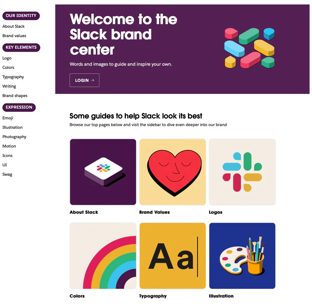
Instead of a physical or PDF brand guide, instant-messaging software company Slack has a brand centre with separate web pages for brand values, colours, typography, writing, brand shapes, emoji, illustration, photography, icons, user interface (UI), and swag.
The typography section, in particular, is an excellent example of communicating your typography hierarchy. Slack uses one font for headlines and another for body copy, and its brand centre clearly illustrates how to use these two fonts for different situations.
#5. Coca-Cola
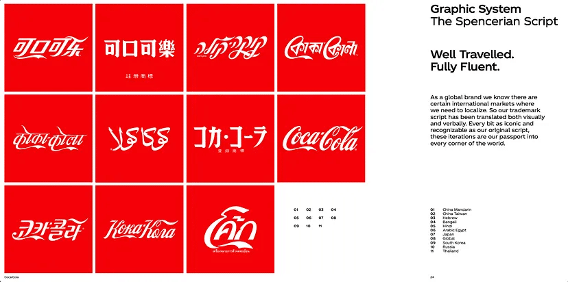
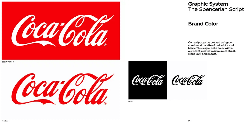
The Coca-Cola logo, a classic example of timeless design, has used a red and white colour scheme since its inception to symbolize passion, youth, energy, love, purity, and class. Executed in Spencerian script — a font that flourished in the U.S. from 1850 to 1925 — the logo encapsulates the unique flair the company’s founder aimed for. This logo remains relevant today, proving that simplicity and alignment with a brand’s core values can create an enduring visual identity. Rather than chasing design fads, the focus has always been on the brand’s mission, vision, and values, making it an ageless symbol that effectively communicates the Coca-Cola story.
Check out the entire brand guidelines by clicking here.
#6. Uber
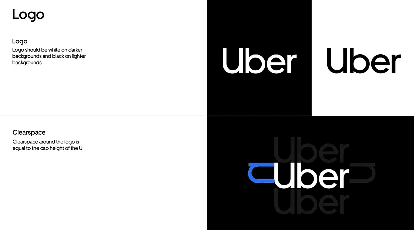
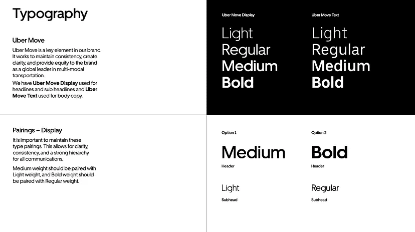
Uber’s brand guidelines are designed to assist partners and sponsors in maintaining brand integrity across various platforms and communications. The guide outlines the correct use of Uber’s logo, including specifications for clear space and lock-ups for partnerships and products. It also describes Uber’s primary and secondary brand colours and the specific shade of blue designated for safety concerns. The guidelines offer direction on typography, featuring Uber Move, and provide examples for text hierarchy and call to action. The document aims to standardize the brand’s visual representation and messaging.
Check out the full brand guidelines by clicking here.
#7. Hulu
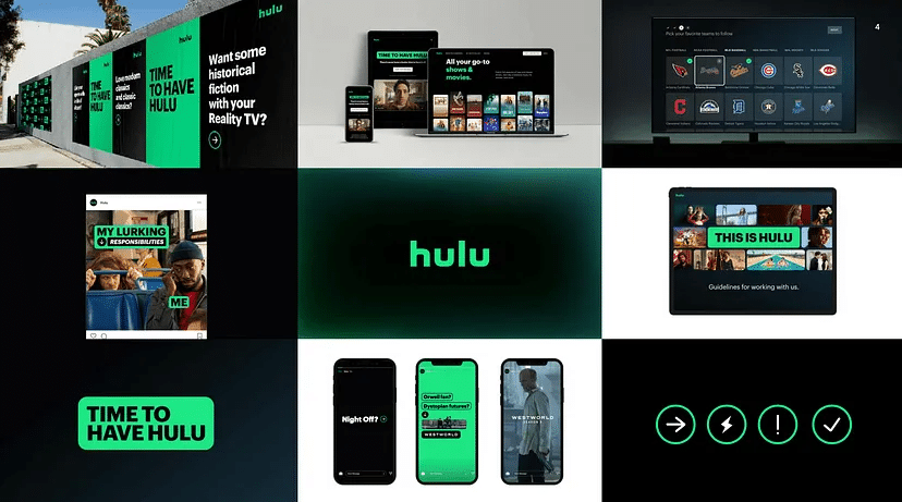
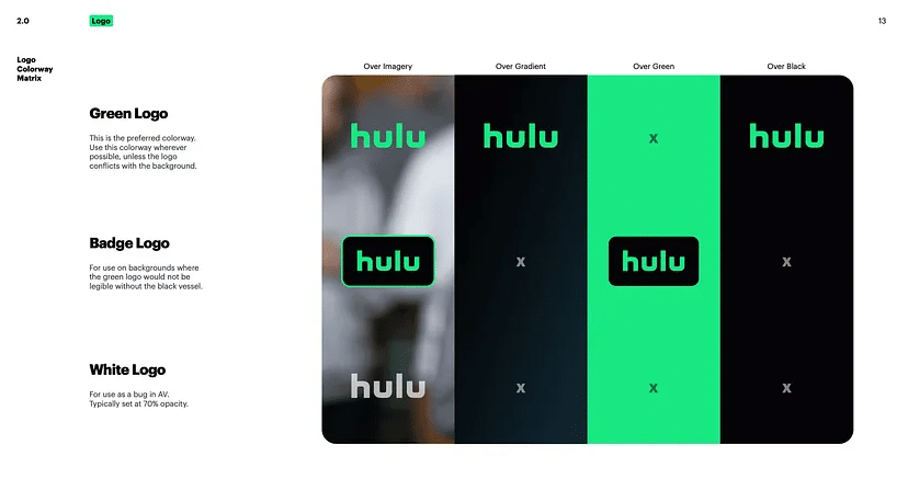
Hulu’s brand guidelines document starts with Global Design Principles and details logo specifications, including attributes, safe zones, and a colourway matrix. It elaborates on Hulu’s colour palette, particularly focusing on “Hulu Green” and other primary colours. The guidelines provide extensive advice on typography, typefaces, and what to avoid. Iconography and illustration rules specify styles, types, and nuances like stroke weight. Finally, the guide covers layout styles, call-to-action buttons, and motion theory principles for video content, ensuring a consistent look and feel across all platforms.
Check out the entire brand guidelines by clicking here.
Brand Guidelines Template
Here’s a simple and effective brand guidelines template you can use as a starting point:
Lamphills Brand Guidelines Template
What Are the Benefits of Brand Guidelines?
Employees from various departments can adhere to guidelines that support an organization’s vision, mission, and values by following brand guidelines, which assist in ensuring effective content marketing and provide several benefits to companies. The following are some of the main advantages of brand guidelines:
#1. Increased Revenue
A Forbes study showed that businesses increased revenue by 23% on average with brand consistency across all platforms. This is why a homogenous team that knows the brand guidelines is invaluable.
#2. Increased Reach and Brand Awareness
Having this unified team can also benefit brand awareness by increasing reach. When employees share marketing messages rather than just the brand itself, they reach 561% more people. This is due to people trusting what they see as “real people” rather than a faceless brand.
#3. Brand Recognition
Having a signature colour can increase brand recognition by 80%. It’s one of the first things our brains identify with a brand and usually the thing that draws us in. Having that perfect colour or colour combination that makes messaging easier to read is more visually appealing to the consumer and can also improve your readership by 40%.
#4. Customer Loyalty
It is known that having happy customers creates customer loyalty, and an effective way to keep customers happy is to provide them with an enjoyable user experience. But did you know that 90% of consumers expect the experience with your brand to be similar across all platforms and devices? Constantly referring back to your brand guidelines can help retain that seamless experience.
#5. Customer Trust
Your customers’ trust is vital to generating sales; without it, revenue will quickly decline. Social media presence is at the forefront of most marketing strategies and a core element in building customer trust. So, having a consistent brand name across all platforms, including your social handles, is vital, as consumers are 71% more likely to buy from a brand they follow on social media.
How Long Should a Brand Guide Be?
A full-length brand guide can be anywhere from 15 to 80 pages, according to Ky Allport and Margaret Pilarski of branding agency Outline. A preliminary brand guide could consist of “just a few pages that have their logo, their colors, their fonts, but not necessarily a lot of guidelines on how to use all of those things,” says Ky.
Bottom Line
If you’re about to start your own business and you get that having a brand guide is a big deal, then you’re off to a good start. But let’s face it — getting the look and feel of your brand just right can be a real headache, especially if you’re not a design guru or if hiring a professional design team isn’t in the budget right now. But welcome to the 21st century, where you don’t have to do it alone!
Use the brand guidelines examples listed above as the scaffolding when you create a brand style, and make it easy to express your beautiful brand everywhere.
Similar Articles
- Small Business Branding Ideas: 15 Creative Ideas for 2024
- Inspiring Brand Voice Examples: How Top Companies Craft Their Unique Identity
- Keep Your Brand at the Top With These 7 Evergreen Marketing Campaign Ideas


