Just imagine you’re organizing a vacation for yourself and your friends. You click on a vacation advertisement offering the best deals and are sent to a lovely page with picturesque destinations, amazing testimonials, and an easy booking process. You’re fascinated, and within minutes, you’ve booked your perfect vacation. That is the beauty of a successful landing page—it easily transitions you from curiosity to commitment.
During my early days as a content writer, I worked on a project with a small e-commerce shop dealing with low conversion rates. We noticed a 40% boost in sales in three months after redesigning their landing pages with optimized design and clear CTAs. Trust me, this experience emphasized the importance of well-designed landing pages.
In this guide, I’ll dive into proven strategies that will help you create landing pages that not only attract but also convert visitors, ensuring your business thrives in 2024.
Key Takeaways
- Ensuring your landing page is optimized for mobile is crucial to avoiding more than half of your potential audience. This includes responsive design, fast loading times, and streamlined user experiences for mobile users.
- Effective landing pages are designed with a clear objective and audience in mind, whether collecting contact information in exchange for valuable content or persuading visitors to make an immediate purchase.
- CTAs should be prominent, clear, and action-oriented, using contrasting colors and persuasive language to stand out. Phrases like “Get it now” or “Let’s talk” can significantly increase engagement over generic “Submit” buttons.
- Regularly testing different elements—like headlines, images, and form fields—and analyzing user behavior allows you to refine your landing page over time. This iterative process helps in maximizing conversions and adapting to changing audience preferences.
What is a Landing Page?

A landing page is a website page that has a specific purpose: to convert visitors into leads. While there are several landing pages, the goal is the same: generate more leads. Landing pages include lead forms that request visitors’ contact information in exchange for something of value, sometimes known as an offer.
For example, compare the landing page of Visit California to their website’s homepage. The landing page is directly targeted to a specific audience (parents looking for family-friendly vacations), with audience data used to create an emotional connection and a popup with a single call-to-action to sign up for a weekly email with inspiration.
In essence, a landing page is a separate web page designed primarily for a marketing or advertising effort. It’s where a visitor “lands” after clicking on a link, which is usually from an email, ad, or social media post. Unlike a website’s homepage, which serves several functions, a landing page is dedicated to a single goal: getting visitors to take action.
The website homepage, on the other hand, has a much broader purpose, serving as an entry point to a variety of audience segments and user flows, as well as multiple calls to action.
Key Elements of a Landing Page
What ever it was that you meant to write in number 1, please correct it. ALWAYS CHECK YOUR ARTICLES FOR ERRORS LIKE THIS. I see a lot of them
Here are the essential elements of a landing page:
- Headline: The first thing visitors see, should be clear, compelling, and directly related to the source they clicked.
- Subheadline: Provides additional context and reinforces the headline.
- Call to Action (CTA): This is the action you want your visitors to take—sign up, buy now, and learn more. It should be prominent and persuasive.
- Visuals: High-quality images or videos that support your message and make the page visually appealing.
- Benefits: Clearly outline what the visitor will gain from taking action.
- Social Proof: Testimonials, reviews, or trust badges that build credibility.
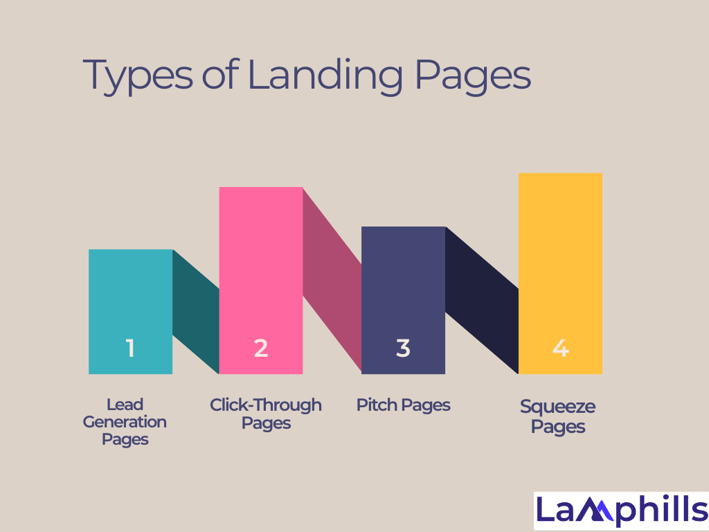
Types of Landing Pages

In the ever-changing world of digital marketing, one thing remains constant: the landing page is critical to success. It’s your initial impression, your conversion driver, and, in many cases, the difference between success and failure for your online efforts. As we are in 2024, the environment of landing page design continues to change, necessitating new ideas and enhanced methods.
#1: Lead Generation Pages
Lead generation pages collect contact information from prospective customers, assisting the sales or marketing team in identifying and following up with prospects who have expressed interest in the product or service.
In exchange for customers’ information, it is typical to give a promotion such as an ebook, podcast, or video series. However, keep in mind that gated information of this nature should be exclusive, easy to access, and tailored to the demands of customers. Otherwise, clients may regret sharing their information and develop resentment toward your company.
#2. Click-Through Pages
Click-through pages promote product benefits using compelling graphics, writing, and videos to entice prospects to click call-to-action (CTA) buttons that take them to checkout or account-creation sites. These pages are an effective way to introduce customers to a new product or emphasize aspects that set it apart.
For example, Synthesia’s website has a click-through page that demonstrates the video creator’s features. Click-through pages enlighten visitors about a product’s worth by developing familiarity and emphasizing key attributes.
#3. Pitch Pages
Pitch pages are simplified versions of click-through pages. One significant distinction is that pitch pages have minimal language and visuals and rapidly convey value propositions. However, the goal of pitching and click-through sites is the same: to get consumers to click a call-to-action button. CTAs on pitch pages frequently link to a trial period or app download.
Alfread’s pitch page is a more straightforward CTA that highlights the product’s benefits and even offers a trial run. This pitch page for Alfread quickly provides a call to action. Download the app or sign up for the newsletter.
#4. Squeeze Pages
Squeeze pages, like lead-generating pages, demand prospects to input contact information before providing access to desired content. While lead generation sites frequently need users to fill out a form with numerous fields to collect data, squeeze pages typically only request an email address or phone number.
“Squeezing” information can be beneficial for producing email marketing leads, but it may anger some users who do not wish to share their contact information yet. As a result, the incentive for providing contact information should be appealing—such as a discount or exclusive material. Or, using the reciprocity principle, provide your readers something like a synopsis of the gated material before seeking their information.
Landing Page Design Best Practices
In today’s digital age, the battle for attention is more intense than ever. Landing pages have become the front line in this war, acting as the critical touchpoint at which visitors decide whether to engage further or go on. As we approach 2024, creating powerful landing pages that resonate with your audience is more important than ever.
Through my years of experience working with numerous businesses, I’ve witnessed personally how the appropriate landing page can convert a casual visitor into a committed customer. Let’s look at the best techniques for turning your landing pages into conversion powerhouses.
#1. Present a Great Offer

All landing pages require you to provide something in exchange for visitors taking the desired action. For example, you could run a promotion on your e-commerce website with a click-through landing page. With a lead-generating landing page, you may give a free e-guide or consultation in exchange for client information, allowing them to join the sales funnel while feeling as if they’re getting something out of it.
Consider your consumers’ tendencies when deciding on the ideal offer to increase conversions. For example, if your consumers are regular shoppers, they are more inclined to become paying customers in exchange for a discount on their purchase. Meanwhile, leads may desire access to crucial information that they find useful, such as an educational guide, case studies, or tools.
#2. Focus Your Headline on Benefits
Your landing page is not the place to explain why you are the best company. Instead, use it as an opportunity to showcase the advantages of your product or service, including the offer. The headline is your first opportunity to tell visitors what to expect from the body of the landing page. If the headline isn’t obvious or relevant to them, they’ll exit the landing page.
Think about your messaging before writing an intriguing headline. All landing page language should fit visitor expectations, letting them know they’re in the proper place and giving them a reason to take the desired action, such as filling out a form.
#3. Match it to Your Ad

Landing page copy should not only be consistent with your company messaging and offer, but it should also be relevant to the ad campaigns. Of course, you do not have to use the same title as in your digital ad or email, but you must inform visitors that they have arrived at the correct page. Your land page design elements should also be consistent to deliver a smooth user experience and match visitor expectations.
#4. Add a Clear Call to Action
A clear call to action (CTA) will help visitors know what you expect from them, making it easier for them to decide whether or not to take action. Of course, not all visitors will convert, but if you have a clear CTA that explains what they need to do, they’re more likely to do so.
A CTA button should be visible in both the copy and the landing page design. Of course, you can have a plain “submit” button, but you can make it more engaging by adding a microcopy that is either informal or professional, depending on your target demographic.
Simply altering the “submit” button on your forms to “let’s talk” will help you get more casual leads while also making your brand appear more friendly and approachable. Furthermore, you should think about the style of your button, employing contrasting colors to make it stick out from other visual elements.
#5. Optimize for Search Engines

Many visitors will come to your landing page from ads, email blasts, social media, and other types of marketing. However, that doesn’t mean you should forgo search engine optimization. Optimizing your landing page gives you more opportunities to convert because you’ll be able to bring more people to it. This comprehensive checklist will guide you through the essential SEO practices to make your landing page a magnet for organic traffic.
#6. Include Social Proof
Word-of-mouth remains one of the most effective strategies to attract people to your business. Social evidence, such as reviews and testimonials, can assist develop trust with potential clients who may be unfamiliar with your company and are unsure whether they can trust you.
Regardless of how good your service is or how many benefits you describe on your landing page, visitors are more likely to believe the word of a person than a company. Using testimonials from real consumers will help you establish relationships with potential customers early on, helping you to convert them more quickly.
#7. Mobile Optimization
In 2024, mobile devices account for over 60% of all online traffic. If your landing page isn’t optimized for mobile, you’re potentially losing more than half of your audience. Here’s how to ensure your pages are mobile-friendly:
- Responsive Design: Make sure your landing page looks great and functions well on all devices. Tools like Google’s Mobile-Friendly Test can help you check your pages.
- Fast Loading Times: Aim for your landing page to load in under three seconds. Slow loading times can frustrate users and increase bounce rates. Use compressed images and streamlined code to enhance speed.
#8. Clear Visuals
Your website’s landing page should direct visitors’ attention to the most crucial sections, usually beginning with an engaging headline. Use visual signals such as typefaces, colors, and positioning to guide people to your call-to-action (CTA). Make sure your CTA button shines out and is easy to find. Engaging visuals plays an important role in your story, and selecting the correct ones is essential for a successful landing page. Make sure that every image, video, and graphic you provide on your page contributes to your goal and encourages the viewer to take action.
In addition to that, visual appeal can make or break your landing page:
- High-Quality Images and Videos: Use professional-grade images and videos that are relevant and high-resolution. An online boutique, for instance, should showcase its products with stunning photos that highlight details.
- Illustrations and Icons: Custom graphics can add a unique touch and help communicate complex ideas quickly.
#9. Optimize Forms for Conversion
If your landing page design includes a form for lead generation, keep it concise. Ask for only essential information and use smart form design techniques, such as inline validation and clear error messages, to provide user-friendly navigation. Every field you add can potentially reduce conversion rates.
#10. Landing Page Templates
If you’re new to landing page design, using pre-made landing page templates can be a great way to get started. These templates often follow best practices in design and layout, making it easier for beginners to create effective landing pages. Many website builders and content management systems offer a variety of landing page templates to choose from, making the design process more accessible.
#11. Prioritize Loading Speed
A slow-loading landing page can deter users and hurt your website’s SEO. Optimize images, minimize scripts, and use content delivery networks (CDNs) to ensure fast loading speed. Tools like Google PageSpeed Insights can help you identify and address performance issues.
Bonus Tip For Beginners Create clear, concise, and informative content that aligns with the visitor’s intent. Implement robust analytics tracking using tools like Google Analytics to measure and fine-tune your landing page’s performance continually.
#12. Remove Navigation
Your website has navigation to allow customers to browse your products and service offerings while learning more about you. Landing pages don’t need navigation because they only have one focus– to convert visitors into paying customers or leads.
Any navigation that may distract potential customers or force them off the landing page with your offer can prevent you from achieving your goals.
#13. A/B Testing and Analytics
Continuous improvement is essential for landing page success. Testing and analyzing your page’s performance will help you make data-driven decisions.
- Continuous Improvement: Use A/B testing to compare different versions of your page. For instance, testing various CTAs can reveal which one resonates most with your audience.
- Utilizing Analytics Tools: Tools like Google Analytics or Hotjar can provide valuable insights into visitor behavior and areas for improvement.
#14. Test Everything
Even if you follow every landing page design best practice you’ve learned, you may still have poor results since every business is unique, and you must respond to the demands of your target audience. Every part of your landing page, including the design, title, and wording, can be A/B tested, allowing you to learn from your triumphs and mistakes. A/B testing can help you convert as many individuals as possible.
However, you should only test one aspect at a time and let your landing page accumulate enough visitors to form an opinion. A/B testing allows you to make informed judgments based on real data, thus, we advocate testing everything until you’ve discovered the right mix of copy and landing page design elements to improve conversion rates.
#15. Measure and Analyze the Performance
Even if you launch the best-performing landing page, it is possible that it will not generate as many conversions as you expected. In this instance, it’s time to assess the page’s online performance and identify areas for improvement.
Once you know this, you may apply landing page SEO tactics like using social media to bring unpaid traffic to the landing page. Just be sure to add goal keywords so that you can see if they have any impact on SEO rankings.
Examples Of Businesses With Effective Landing Pages
All the pages featured in this section make use of the landing page design best practices that empower you to convince users to become leads and customers, including social proof, action-oriented CTA buttons, and much more.
#1. Uber Eats
Consumers looking for restaurant delivery options are likely to come across this Uber Eats landing page. This is a great example that hits on all of the landing page design best practices discussed above.
- Clear and concise messaging: The core value proposition is communicated clearly and concisely: “Order food to your door”—the headline immediately captures visitors’ attention.
- Prominent CTA: The CTA button’s placement and design draw attention and make it easy for users to proceed with ordering. The clear, simple message: “Find food,” encourages visitors to take immediate action.
- Minimalistic design: The landing page employs a clean and minimalistic design approach. It avoids clutter and unnecessary elements, focusing on the essentials. This helps visitors quickly understand the purpose of the page and navigate through the content easily.
- Strong visual elements: The page utilizes high-quality visuals to showcase appealing food images that capture the viewer’s attention. These visuals help create an emotional connection with the audience and make the food delivery experience more enticing.
- Mobile optimization: Uber Eats uses a mobile-first approach to ensure the landing page experience is optimized for mobile devices. The layout is responsive and adjusts well to different screen sizes, offering a seamless user experience across devices.
When targeting prospective drivers, Uber Eats serves up a separate landing page specifically tailored to attract and onboard potential delivery partners.
In addition to adhering to many of the same fundamental best practices as the consumer-facing landing page, the driver-focused landing page focuses on the specific needs and motivations of the target audience. When targeting prospective drivers, Uber Eats serves up a separate landing page specifically tailored to attract and onboard potential delivery partners.
#2. Upwork
Upwork’s business landing page, aimed at hiring managers and recruiters, adheres to key landing page design best practices that can boost engagement and conversions. Upwork, like the other examples, has a clean layout and color palette, a benefit-driven title, relevant graphics, and a compelling call to action. It also implements one more crucial best practice:
- Social proof: Social proof is used throughout the landing page in the form of an overall client rating (“4.9/5 stars across 2.9M+ reviews”), ratings by category, a selection of featured freelancers with individual ratings, and finally closing with a testimonial from a Microsoft client. The cumulative effect is a strong endorsement from a large number of customers, giving prospective users confidence that they won’t be disappointed.
#3. Dr. Sasquatch
The Dr. Sasquatch landing page stays true to its brand name and features humor on the page, in addition to explaining what the product does. The social badges, user videos, and testimonials add credibility to the offer. The competitive grid showcases exactly why visitors should shop the Dr. Sasquatch soaps to “smell like a champion.”
#4. Magic Mind
Magic Mind’s landing page introduces the product with a succinct headline and descriptive text. The bullet points above the fold tell users all they need to know about the benefits of taking the “world’s first productivity shot.” The CTA button has a direct action on it, “Save 35%,” and the 30-day money-back guarantee badge reassures the visitor that the offer and brand are credible. Below the fold, the page also has customer badges, user-generated content, customer testimonials, and an FAQ section.
#5. Cometeer
The Cometeer landing page highlights its unique selling point: “Earth’s Best Coffee Comes From the Freezer.” The sub-headline provides more information, while the backdrop video demonstrates how Cometeer coffee works. The page also includes customer testimonials, an expert section, product characteristics, and user benefits—all of which convince the consumer to purchase the flash-frozen coffee.
Which Choice Is the Best Practice When Designing a Landing Page?
To make your landing pages more effective, you should: Make headlines clear, concise, and engaging.
What Are the Principles of Landing Page Design?
Design them with clear goals and target audiences in mind.
Which Software Is Best for a Landing Page?
- Zoho LandingPage. by Zoho
- Instapage. by Instapage
- Builder.io. by Builder.io
- Leadpages. by Leadpages
- See What Your Peers Are Discussing. Check out Peer Community to view peer-driven insights, advice, and guidance to drive technology and business decisions
- ClickFunnels.
- Landing.
What Is the Landing Page Strategy?
A landing page strategy simplifies their decision-making process and gives them immediate access to what they may have been searching for.
Conclusion
In today’s fast-paced digital world, where every click counts, the design of your landing page might be the difference between success and failure. It’s more than simply looks; it’s about providing a smooth user experience that directs visitors to take the right action. Success is achieved by a careful mix of aesthetics and usefulness, user experience and trust-building, and simplicity and captivating content.
Follow these best practices, and your landing page will be an effective tool for converting visitors into customers and generating business growth. Finally, remember that creating a high-converting landing page frequently necessitates experimentation and ongoing refinement via A/B testing and data analysis. So, continue to improve your landing page over time to get the best outcomes for your website.


