Your portfolio is a testament to your skills and experience working in the industry and the most important page on your website. It can make all the difference in whether you can land another client and grow your business to the next level.
You can write an epic bio that makes you sound like the answer to every business owner’s prayers, but at the end of the day, all your site visitors want to know is: “What have you done before, and what can you do for me?”. Marketing professionals commonly treat their portfolios as passive work showcases rather than active sales tools.
I’ve researched and spoken to experts on this topic to share impressive ways you can make your web design portfolio turn your site visitors into paying clients.
But you can’t know how to make a web design portfolio without first understanding it what it’s all about. Let’s get a firm grasp!
Key Points
- A web design portfolio is a hand-picked showcase of projects, and case studies a designer chooses to present his best and most promising work examples to potential clients or employers.
- A web design portfolio website must represent you and your work and include a homepage, short bio, portfolio, and contact information page.
- There are many indisputable reasons why every web designer needs a killer portfolio to put his best foot forward and get hired for web design projects; these reasons include portfolios make you searchable and accessible to clients, portfolios demonstrate your expertise, let clients get to know you and clients are short on time.
- To make a perfect web design portfolio, some things shouldn’t be included, such as too much or too little work, outdated work, unfinished projects, client work without permission, and personal or irrelevant content.
What Is a Web Design Portfolio?
A web design portfolio is a hand-picked showcase of projects, and case studies a designer chooses to present his best and most promising work examples to potential clients or employers.
In the web design industry, portfolios are considered a point of introduction where designers have their first opportunity to introduce themselves, their personality, artistic style, professionalism, etc.
What Should Be in a Web Design Portfolio?

A web design portfolio website must represent you and your work. The color scheme, fonts, typography, layout, and images should emphasize your brand throughout several vital pages.
#1. Homepage
Your homepage should immediately hook potential clients with eye-catching visuals and project work that sparks curiosity. This page is also where you’ll introduce yourself, whether with graphics, a photo, or fun animations. Whatever you choose, ensure it represents what sets you apart.
If you have a design niche, like 3D effects or interactive web pages, make that skill evident immediately.
#2. Short Bio
Many portfolios have an About Me section that provides basic information regarding their owners. In addition to your name, contact details, and e-mail address, you can use this space to include a short summary of your professional journey. This helps potential clients find out more about what you do.
#3. Portfolio
The portfolio page highlights your most impressive projects. Select a diverse selection showing off various skills across your specialized industries. Describe each, covering your key role in the project, the challenges you solved, the skills you used, and your thinking behind the strategy. That way, potential clients can see what you excel at and how you approach your work.
#4. Contact Page
The contact page often meshes with the “About” page, but either way, providing contact information is necessary so potential clients can get in touch.
If you want to list your available services and rates, this page is the ideal place to do it so clients can check the costs before reaching out.
After recognizing what should be in a web design portfolio, the question arises of why designers actually need a portfolio.
Why Do Designers Need a Web Design Portfolio?
There are many indisputable reasons why every web designer needs a killer portfolio to put his best foot forward and get hired for the web design projects he has equipped himself to master. This is true for establishing his credibility and increasing his likelihood of getting hired for promising high-caliber projects. Here are some of the top reasons:
#1. Online Portfolios Make You Searchable and Accessible To Clients
Everybody knows that nowadays, it’s all about Google. When employers are looking for a web designer, whether they specialize in a certain vertical or are located in a specific location, searching accordingly online will bring them one step closer to their candidates.
For example, when potential clients are looking for a freelance web designer based in Seattle, Washington, they’re likely to search for a “freelance web designer in Seattle” or something similar. If your design portfolio meets the SEO requirements so that you’ll appear in those search results, you’re in good shape for landing that gig.
#2. Portfolios Demonstrate Your Expertise
When looking to hire an independent web designer or a design agency, clients are primarily interested in seeing the concrete work that the designer or designers can produce.
True, stating different factors, such as which tools you use for design, which design niche you specialize in, and so on, are questions that clients want to tick off on their hiring checklist, but they are, in fact, most interested in seeing work examples. Once they see what you can develop, they can better understand whether your design expertise, style, etc., fit what they’re looking for.
This means they want to see real, tangible projects that creative professionals have done in the past. Clients want to see what your thought process involves how you would turn their ideas into visual content, and apply your creativity and design skills while doing so. They want to see how you respond to challenges and how you take a blank canvas and produce a unique, impressionable website that effectively communicates who they are and what they do.
#3. Clients Are Short on Time
There’s also a practical side to why those looking to hire find project showcases and case studies to be a more efficient way of evaluating designer candidates. Clients who are seeking design professionals to create their websites often receive hundreds of portfolios and resumes. Time is of the essence, deadlines need to be met, and people want to have their questions answered quickly.
Sifting through pages of explanations of who you are as a designer and why your experience is relevant is less appealing to those short on time. Instead, reviewing projects you have completed can be time-efficient for clients to evaluate whether your skills fit their needs.
#4. Let Clients Get To Know You
The client-designer relationship is a crucial element in a successful design project. It’s more than just building a mutual understanding of what the client needs and the designer can create. There’s communication involved and a personal connection that needs to “click.” This is why, when viewing your portfolio, prospective customers will want to get to know you as a person to understand who they’d be working with and what kind of dynamic will be contributed to their team of professionals.
Your About page is often the forum for letting your portfolio visitors get to know you. Think of it as an individual or one-on-one version of the standard About Us page that you’ll typically see on company websites.
Letting clients get to know you isn’t only about writing your story on the About page. It’s about identifying which elements in your personality you want to emphasize, such as your bold taste and knack for bright color schemes or your way with words manifest in the titles and descriptions you use throughout the portfolio. You can also consider your choice of imagery to represent your personality, whether choosing photographs of beautiful scenery and landscapes, contemporary illustrations, pictures of you hard at work with walls of mind maps around your workspace, and so on. The floor is yours
How to Make an Impressive Web Design Portfolio
We are now on the most important section of this article. Consider following these impressive tips when working on your web design portfolio to help improve its visibility and effectiveness:
#1. Include Examples from Different Niches
From ballet studios to tattoo parlors, most businesses need websites to survive. If you’ve done web design for many clients, don’t be afraid to show that versatility in your portfolio.
Various niches can demonstrate different web design abilities. For example, designing a photography website will probably involve showcasing the pictures to their fullest extent.
On the other hand, a writer’s website may have minimal media elements. You might have to find different ways to make the content stand out.
Furthermore, no two sites are the same. Therefore, showing your proficiency in wildly different niches can be a powerful testament to your adaptability. For example, here’s the varied portfolio of the Web Design Yorkshire agency:
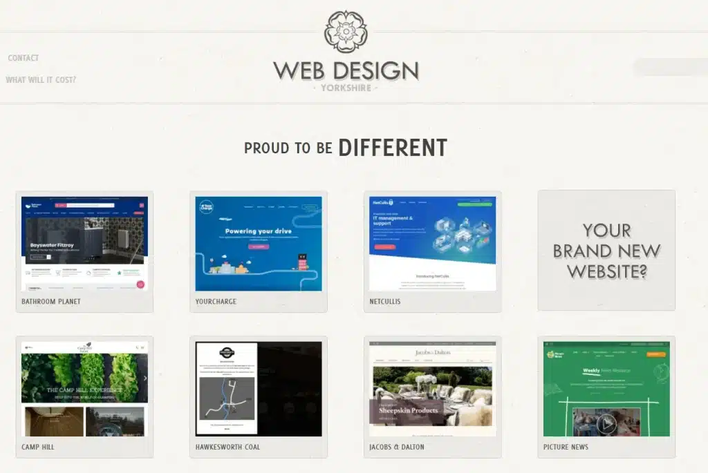
As you can probably tell, each item is unique. This agency displays websites with different color schemes, layouts, and tones. However, the overall focus on media across the examples shows a cohesive style.
This portfolio selection has two distinct benefits. Firstly, each unique page demonstrates the agency’s ability to address a client’s needs regardless of their industry. Nevertheless, the consistency among the samples can give customers an idea of what their tailored websites might look like.
As a bonus, including a wide range of niche designs can help add diversity to your page. Unique layouts and color palettes can keep your website from looking too uniform.
However, I recommend that you avoid cluttering pages with clashing elements. Doing so can result in a chaotic-looking portfolio that distracts from the substance. Spreading the samples out instead can obtain the same results with less confusion.
#2. Feature Testimonials from Happy Customers
A web design portfolio will likely give clients an idea of your technical skills. However, that’s only half of the story.
As a web designer, you probably work closely with your customers. As such, demonstrating that you can fully and professionally address their needs can go a long way toward convincing potential new clients to work with you.
One reason for this is the customer’s expectations. Even the best-designed webpage would miss the mark if the client wanted something different from you. Glowing reviews can show your ability to direct your skills towards specific goals.
Furthermore, reviews can speak to your professionalism. Nobody likes working with a difficult business partner. That’s why you may want to showcase testimonials that highlight your collaboration capabilities, such as:
- Promptly finishing tasks on an agreed-upon schedule
- Working through any creative disagreements with grace
- Maintaining clear and consistent communication with customers
- You can collect reviews by asking your clients directly. If you use this method, try to do so immediately after finishing projects. That way, your work will still be fresh in their minds.
On that same note, you may also want to consider white labeling your services. Removing external branding can help keep your agency at the center of attention.
Read Also: Best 8 White Label Business Opportunities And Ideas in 2024
You could also use Google reviews. The Charley Grey agency provides an example:
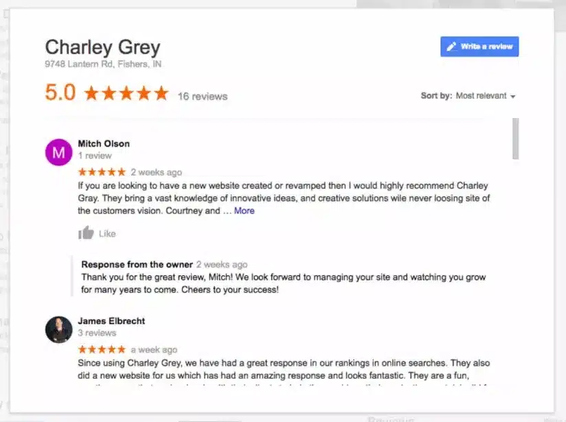
When picking reviews, try to focus on comments highlighting your unique services. Many web designers are out – standing out from the crowd can help you land your next job.
#3. Make Your Web Design Portfolio as Easy to Find as Possible
No matter how well-made your web design portfolio is, it won’t help you land new clients if people can’t find it. I recommend taking a few crucial steps to get as much exposure as possible.
Link to your portfolio wherever you have a web presence. If you use social media to promote your work, you might like to use this strategy – directing clients to a complete portfolio can take them one step closer to hiring you.
Another tactic to consider is Search Engine Optimization (SEO). Using the right keywords can go a long way toward boosting your place in the search engine rankings. As a result, you may be able to increase your portfolio’s organic traffic.
If you’re unsure how to improve your SEO best, consider using a premium search optimization tool. Think of it as an investment: with the proper software, you’ll also be able to improve your clients’ sites.
For example, you could invest in the premium version of Yoast SEO. It audits your content in real time and provides suggestions on how to optimize your posts and pages:
Read Also: What Is Exact Match Keywords? Everything You Need to Know for Your Next Ads Campaign
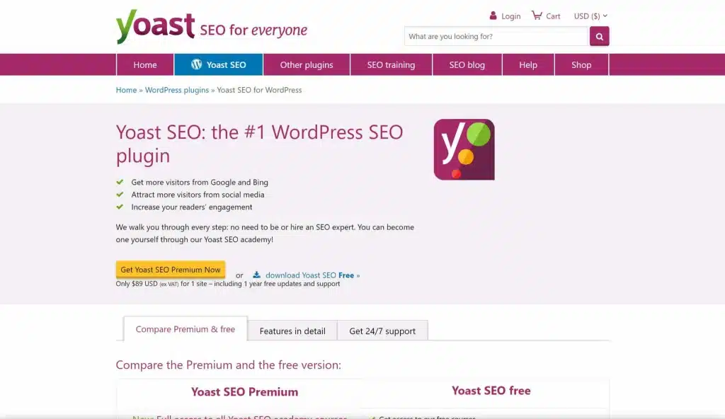
Finally, try to keep your domain name short and sweet. Long, complex URLs may discourage clients from clicking on links. They may also make it harder for people to remember your brand name.
However, the process doesn’t end once a user has reached your website. You should also consider a few ways to keep them on your page.
For example, clear menus can make navigating your site easier. Optimizing your website for mobile devices is also essential in the age of smartphones. Changes such as this can help ensure you don’t frustrate high-paying clients after attracting them to your portfolio.
#4. Organize Your Web Design Portfolio into Relevant Sections
As I discussed earlier, samples from different niches can show your versatility. However, you may want to ensure a method to deal with the madness.
For example, some clients may visit your site for a specific style. If all the niches are randomly lumped together, they might have to hunt through dozens of examples before finding the relevant ones.
You probably don’t want this to happen – chances are that your clients won’t appreciate starting a business partnership with a scavenger hunt. That’s why I recommend that you use categories.
A few simple categories can go a long way toward an orderly portfolio. You can divide your work by niche, layout type, or other groupings that make sense to you. You can consider the drop-down filter menu from Grain & Mortar as an example:
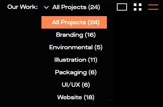
Regardless of how you decide to format these sections, we recommend that you limit their numbers. A massive list of categories can intimidate your clients. You also risk getting too specific, making your organization lose its focus.
However, it’s also worth mentioning that every portfolio is different. You don’t have to include categories if you don’t think they’ll help. I recommend keeping it simple and trusting your web design instincts if you’re unsure.
#5. Add Links to Encourage Networking
This tip may seem obvious, but it’s also important. You can’t get new clients if they can’t contact you. Thus, it’s wise to make it possible for potential customers to contact you.
Furthermore, your contact details should also be evident. You could put them in the header so clients can reach you before hiring you.
You can use Trent Walton’s web design portfolio as an example:

Casual contact links such as these can help increase the odds of getting a message. This is because users may feel intimidated by the formality of an official quote.
Try to include as many contact methods as possible. If you’re active somewhere, send a link to it. This approach will also allow your clients to reach you through their preferred channels.
However, we also recommend making a dedicated quote contact page. After all, clients will always be eager to skip the small talk and get straight to business. You might want to link these quote pages to a single landing page. That way, users won’t get distracted by other URLs when they’re reaching out. In turn, this may help increase your conversion rate.
#6. Prioritize Your Best Work
Let’s be honest for a second: not every website you design will be equally quality. It’s nothing to be ashamed of – varied results are facts of life that nearly every professional deals with.
However, you probably want to use your web design portfolio to put your best foot forward. Therefore, you likely won’t display examples you aren’t proud of. Still, there’s a strong chance that some samples will shine brighter than others.
While picking your top-tier examples, try to vary the niches as well. That way, you can show that you always rigorously apply your skills regardless of the client’s needs.
You may even want to make your most impressive examples into case studies. For instance, you might offer a short article that explores your creative process and shares how you arrived at the result.
For example, the Dogstudio company provides a detailed case study of its work on the MSI Chicago website:
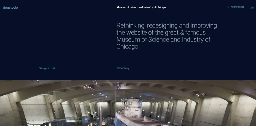
This type of walkthrough can emphasize how seriously you take your responsibilities. It can also highlight your greatest strengths as a web designer. For example, you can showcase your big-picture thinking or focus on even the most minor details, such as font choice.
Focusing on a single web design sample such as this puts a heavy spotlight on one project. Nevertheless, it’s not your only option.
Another strategy is using more subtlety. Instead of a deep dive into one part of your portfolio, you can put your highest quality work at the top of the page. That way, even clients who only glance at your site will see your full potential.
#7. Include Context for Each Sample
In the last tip, I discussed the advantages of laying out your design process for a single project. However, your best work isn’t the only content that deserves context.
Every project in your web design portfolio should give at least an overview of the brief. Without understanding the goals you wanted to achieve, it may be hard for clients to gauge how successful you were.
Even if it’s brief, we recommend that you always try to answer a few vital questions with your context:
- What did the client want?
- How did you accomplish it?
- What was unique about this specific design?
- Moreover, don’t be afraid to avoid any difficulties you conquered! As with any other job, web design will always have challenges.
Speaking openly about how you approached a project shows that you’re flexible. It can also help assure clients that you can handle any issues with their websites.
You may also want to mention if you still provide any maintenance to the sites you created. If this feature is a big part of your agency’s services, including it in your context is essential.
How Do I Make a Web Design Portfolio With No Experience?
I have explained the 7 impressive ways to make a web design portfolio above; this section will give you a comprehensive checklist guide on making a web design portfolio without experience. Check out our downloadable checklist guide below:
Web Design Portfolio Examples and Inspiration
Here are the best portfolio websites covering different skill sets, personalities, and specialties in web design.
#1. Empathy Template

This Empathy template by Ty Hughey is a solid base for an agency or studio web design portfolio. With consistent layouts and built-in mobile responsiveness, Empathy delivers bold, beautiful, and professional design.
Scrolling through the template reveals sections where you can add high-quality images. Each image pairs with a box to add a copy and a title so you can describe the projects and draw potential clients further into the site.
With its built-in pages for your projects and services, you can transform this template into a highly customized personal portfolio.
#2. Dann Petty
Dann Petty is a well-known freelance designer specializing in designing websites and apps for big companies like Google, Airbnb, North Face, and Uber.
What I love about his website is how well the homepage works. First, a strong statement at the top lets you know exactly what kind of design work he specializes in. He hints at past client work with live-updating text for companies like “Airbnb” “Uber” and more. There’s a beautiful gallery of work below to get a sense of his past work and what he can do for the next client.
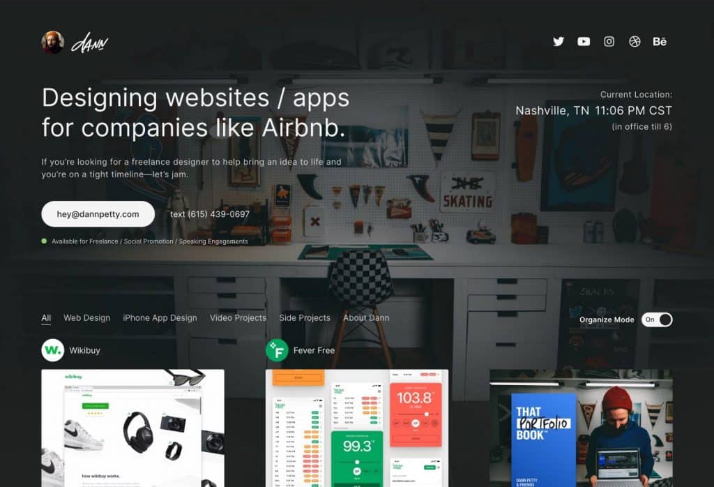
Most importantly, a clear call-to-action with his contact information is repeated a few times. It’s first as a button underneath the statement at the top of the site, and here it is again once you scroll to the bottom, reminding you he is available for freelance work. It’s ok to add your contact information in more than one place, especially since that’s the goal of your portfolio website. Take note of Dann’s website and find the best places to add your contact information.

#3. Cameron Ward
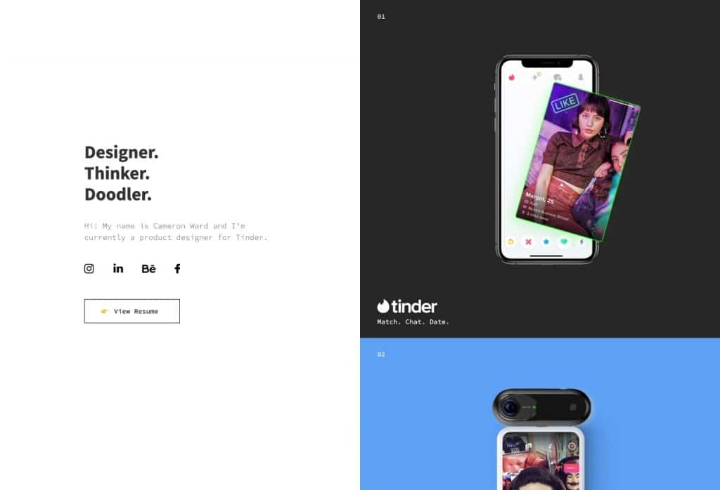
This is an excellent example of a simple product design portfolio that happens to be built on Webflow. The homepage has a stunningly simple design that gets right to the point, which is essential for prospective clients looking to hire a web designer. The design utilizes a split layout on the desktop version. Each case study takes up many screens in these big, colorful blocks.
There are only 5, so we can quickly understand their product design skills. As you’ll soon realize in the section where we share tips for what to include in your portfolio, you don’t need a lot of examples of your design work. It’s better to include fewer high-quality examples, show the depth of your work, and the best of your abilities. You don’t need to include every project you’ve ever designed; be selective and only show the best.
#4. Adrian Z
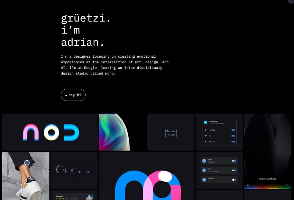
You’ll want to check out Adrian’s portfolio in your browser tab, as there are so many delightful interactions to experience. You’ll notice the ongoing trend of a strong headline, a subtle introductory paragraph that tells you more about the designer, a quick call-to-action to contact them, and a beautiful gallery of work. But this site takes it to the next level with all the quality of design mockups and stunning interactive experience.
What Should Not Be Included in a Design Portfolio?
Here are lists of the things that shouldn’t be included in a design portfolio:
- Too much or too little work
- Outdated Work
- Unfinished Projects
- Low-Quality Images
- Personal or Irrelevant Content
- Client Work Without Permission
What Does a Good Portfolio Website Look Like?
A good portfolio website should be visually appealing, easy to navigate, and effectively showcase your skills and work. Here are the key elements that make a portfolio website stand out:
- Clean and Professional Design
- Strong Visuals
- Clear Navigation
- Compelling About Page
- Showcase of Work
- SEO and Performance Optimization
Bottom Line
In conclusion, a web design portfolio is vital for landing new clients. Crafting it with care can help you show off your skills and stand out from the crowd. Fortunately, following a few rules of thumb can help you optimize the effectiveness of your professional website.
Related Articles
- Crafting the Perfect Journalism Resume: Tips for Standing Out in a Competitive Field
- 10 Free Websites To Create An Online Portfolio: Stand-Out Online Portfolio Examples That Dominate
- PORTFOLIO MANAGEMENT SOFTWARE: Top Investment Software In 2023
- PROJECT PORTFOLIO MANAGEMENT: Meaning, Top Software, Processes & Benefits


