Have you ever paused in front of a billboard because the colors captured your attention? Perhaps you clicked on an online ad because the brilliant colors made it irresistible. This is the power of color in marketing. Colors do more than just make things appear nice; they also play an important part in generating emotions, motivating behaviors, and making companies stand out. In my years of working with many brands on marketing initiatives, I’ve witnessed personally how a well-chosen color palette can make all the difference. So, let’s look at how you can use colors to enhance your marketing campaigns. Below are ten tips to aid you along the path.
Key Takeaways
- Colors can influence emotions and behavior, making them powerful tools in advertising. For example, red can evoke urgency and excitement, while blue fosters feelings of trust and calmness.
- Choosing colors that align with your brand’s values is crucial. For instance, wellness brands benefit from cooler shades like blues and greens to reflect calmness, while energetic brands may use vibrant reds and oranges.
- Using the right colors can directly influence customer engagement and boost conversion rates, as seen when a brand’s shift to a more suitable color scheme leads to better alignment with its audience’s expectations.
- Different colors may carry various meanings across cultures and contexts, making it important for brands to consider local perceptions when selecting colors for their campaigns.
- To avoid confusing the audience, brands should use no more than three colors in their marketing materials. This helps maintain a consistent and clear brand message, making it easier for customers to connect with the brand’s identity.
What Is Color Psychology?
The idea behind color psychology is that colors can cause an individual to feel a specific way, which can influence how they behave. Although it’s not quite as easy as seeing red and becoming angry or blue and feeling calm, this is close there. According to medical research, red is associated with higher blood pressure, while blue is associated with lower blood pressure.
In other words, color can significantly influence mood because of its behavioral effect. Thus, according to Architectural Digest, selecting the appropriate paint colors is essential for establishing the mood of your house. Cool colors generally relax, whereas warm hues energize. The psychology of color strategies impacts your brand and marketing similarly, leading us to the next section.
What is The Influence Of Colors In Marketing?
Understanding color psychology is essential before moving on to useful advice. One customer, a wellness company, was having trouble engaging their audience with their digital advertisements, as I recall. Although their website was adorned with vivid orange and red hues, their target audience was looking for tranquil, calming experiences. To solve the problem, we simply changed the color scheme to lighter shades of green and blue, and the effect was seen right away. Customers reported how their site “felt” more in line with the brand’s vision, and their engagement rate improved.
Colors can influence consumer behavior and establish a connection between your brand and product. For this reason, they are crucial for marketing and maintaining brand consistency. Hence, choosing the appropriate colors could make it easier for you to increase your conversion rate. Some of the top benefits of using colors in marketing include:
- You can convince consumers to think a certain way or react in a particular manner.
- If you associate a specific color with your product or service, you may make a subtle statement about your brand or product.
- The right color scheme could change your target market’s mood, making them more likely to behave in a certain way.
For all these reasons, you need to think carefully about colors, vibrance vs. saturation, and your overall marketing strategy if you want your brand’s color palette to be effective.
The Meaning Of Colors: What Color Attracts The Most Attention in Marketing?
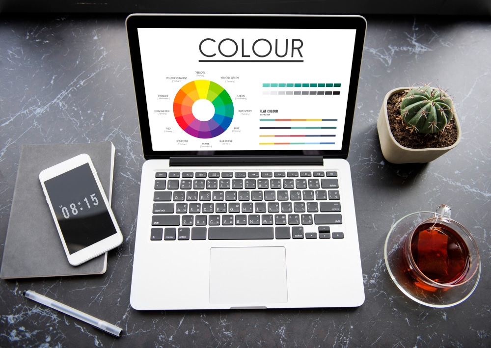
Think about the meaning of the colors as you choose which ones to use in your marketing. Everyone has a symbolic meaning; therefore, you need to carefully consider how to utilize each one. To assist you get started, I’ll go over some of the most well-liked colors for marketing below, along with their meanings.
#1. Red
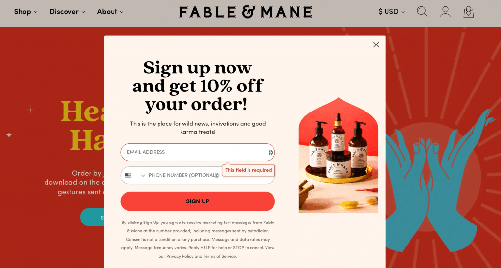
This vibrant color is linked to passion, boldness, power, enthusiasm, and energy. Red call-to-action buttons in sales provide a sense of urgency, which encourages customers to convert. It can affect people physically as well since it causes hunger.
Red, however, has the same potency to arouse negative emotions. It stands for rage, cautions, peril, disobedience, violence, and suffering. Stop signs compel vehicles to stop, whereas red police lights alert drivers to stop. Anger is also shown as a flaming red beast in Disney’s Inside Out. Red may be effective in branding when utilized correctly.
Coca-Cola, for instance, has been using the color as their hallmark for many years. Red promotes the consumption of its beverage products, which is consistent with the lively branding of the company: Right now, “Real Magic” is its motto.
A common color used by many businesses in their marketing initiatives is red. It is meant to evoke passion, vigor, love, and strength. Should you wish to support your target market to do something specific, Red can give them the motivation to do so.
#2. Blue
The color blue is the most popular choice worldwide, according to 35% of women and 57% of men. Brands agree: 33% of the largest brands use this soothing tone in their logos, making it the most popular logo hue.
Feelings of safety, power, insight, and trust are associated with the color blue. Social media organizations, such as Facebook and Twitter, usually use blue to convey reliability, which is an important characteristic for companies that handle large amounts of customer data.
However, blue also carries unfavorable connotations. Since blue foods are scarce, the color makes us feel less hungry. It can also imply feelings of aloofness and incivility. Additionally well-liked is the color psychology of blue, which is connected to loyalty, trust, competence, and peace. 40% of Fortune 500 companies used blue in their logo. There is aredifferent shades of blue, and you may want to consider which shade is best for your campaigns.
#3. Green
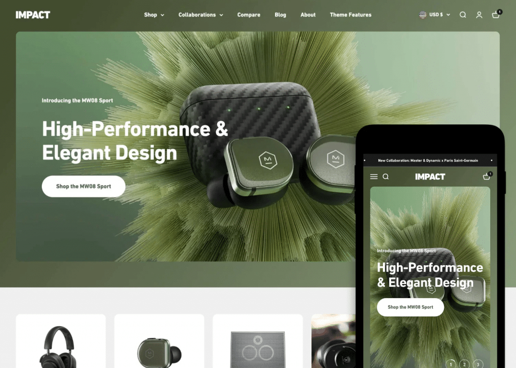
Green, in its purest form, is the color of life. It is associated with sentiments of calmness, health, wealth, hope, and freshness. It is reminiscent of grass, trees, and bushes. Nonetheless, due to its basic qualities, it can also stand for monotony, staleness, and blandness.
Owing to their standing for providing fresh, premium goods, Whole Foods employs green. Since the business bills itself as “America’s healthiest grocery store,” it seems sense to use a color that symbolizes growth and health in line with its objective.
So, incorporate the properties of freshness, healing, nature, and quality into your brand by utilizing green color psychology in your marketing. Consider using green if you want your brand to be connected to sustainability in light of the growing attention being paid to the environment.
#4. Yellow
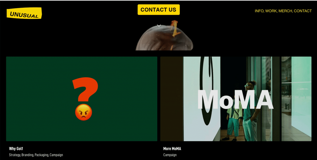
Yellow, like orange, is a color that symbolizes optimism and youth. It’s the color of rubber ducks, cheerful faces, and daisies. Yellow is a color that brands utilize to appeal to extroversion, optimism, creativity, and warmth.
Nonetheless, yellow branding might also encourage worry, irrationality, and terror. Yellow is used on street signs, traffic signals, and police tape. Put another way, before you dive into the color, keep this cautionary tale in mind.
Yellow’s optimism is well-utilized by McDonald’s golden arches. The fast-food chain is associated with youth and happiness due to its yellow logo combined with an appetite-inducing red color. Happy Meals’ yellow happy face further confirms that it is a kid-friendly meal.
Warmth, joy, and inventiveness are associated with the hue yellow in color psychology. Though yellow might not be as popular as some other colors, it can still help differentiate your brand from the competition.
#5. Orange
Bright colors are symbolic of bravery, inventiveness, and self-assurance. It also works well with non-corporate brands owing to its playful nature. Due to its association with the sun, orange also evokes feelings of warmth.
However, the color also has some underwhelming associations. Feelings of annoyance, deprivation, and lethargicness may result from it. It could come across as naive or immature. Orange is the color that 29% of people dislike the most. It’s what separates Cheetos from Hermès.
Among the most recognizable orange logos is Nickelodeon’s splat. Orange corresponds with their bizarre programming since it evokes sentiments of creativity and even immaturity. quirky branding. Only a company with an orange aesthetic could house shows like SpongeBob Squarepants and The Wild Thornberrys.
#6. Pink
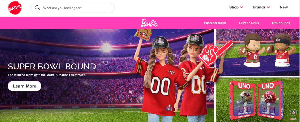
Pink, the color most often associated with femininity, can suit any brand seeking a feel that is more whimsical, youthful, and innovative. For instance, T-Mobile uses its magenta hue to set itself apart from rivals.
However, pink can also evoke sentiments of innocence or rebellion. If you’ve ever visited Victoria’s Secret, you know that the pink walls may get sickening after a while. Its initial popularity has been observed to decline as consumers grow accustomed to the color.
Pink may be the ideal balance of femininity and youth for brands like Barbie. The play doll giant markets its products to a younger clientele with the help of its pink trademark.
If you use the color pink in your marketing, your brand may appear compassionate, sincere, sweet, and sophisticated. Even though pink is frequently associated with childcare products, it can be closely tied to other products and services.
#7. Purple
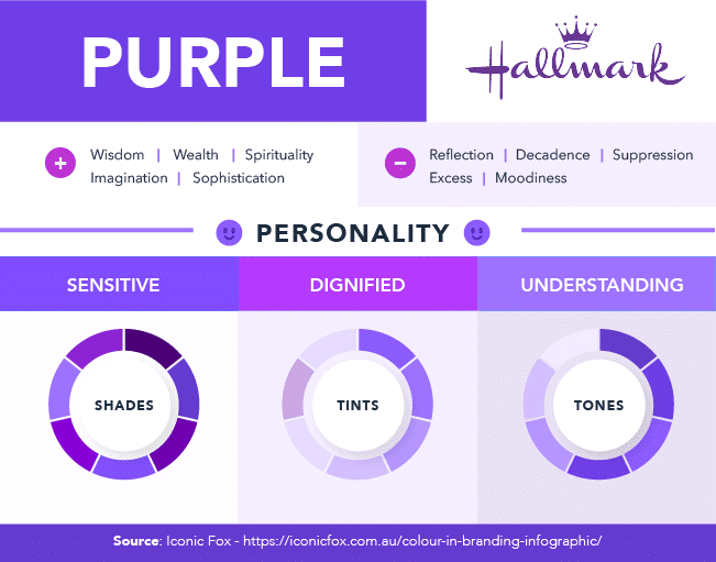
Purple has always been associated with royalty. It should therefore come as no surprise that it is still connected to ambition, extravagance, and regal status. You might wish to take spirituality into account when choosing your brand’s colors because purple color psychology has been linked to it.
Purple is a regal and superior hue. High-ranking officials of the Roman Empire wore Tyrian purple, which at the time was more expensive than gold. Even wearing purple was forbidden by Queen Elizabeth I for non-royal family members.
Owing to these historical connotations, purple exudes an air of wisdom, luxury, and sophistication. Companies can utilize color to convey exceptional experiences, goods, or services. However, purple may also signify extravagance, moodiness, and decadence, so be careful to create balance when using this color.
Since purple has a more feminine association, Hallmark uses the tone as a nod to its predominantly female audience. The TV channel also uses color to convey its unique offering of movies — only a few brands use purple, so the color can make a company stand out.
#8. Black
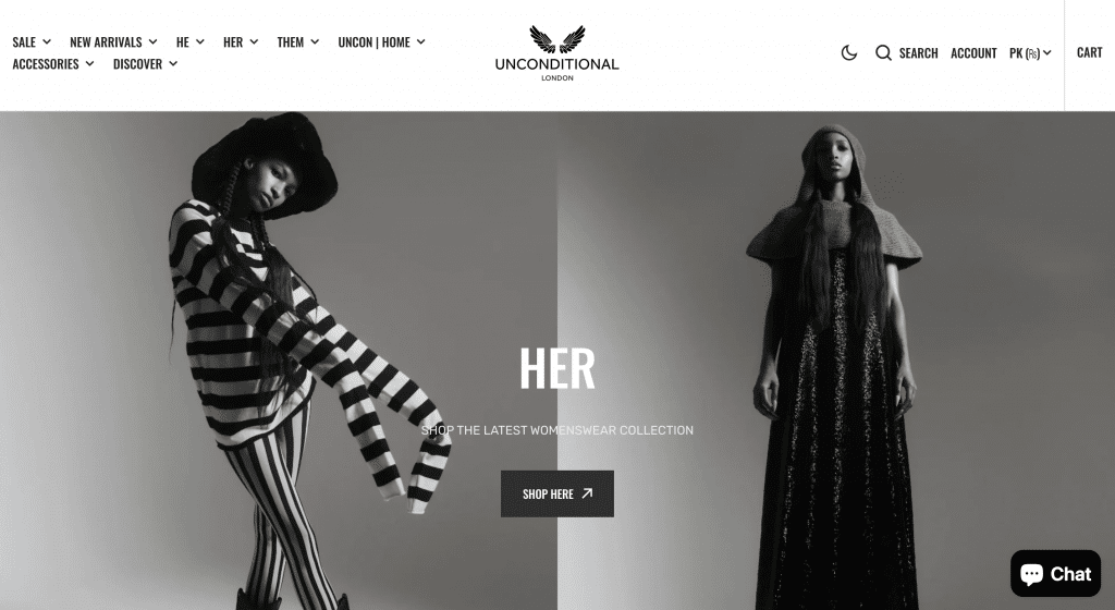
You can find black everywhere—on emails, websites, and logos. Using black as a standard color can help a company look powerful, sophisticated, and refined. Black is a common color used by high-end brands, like Chanel, to create a sleek and sophisticated logo. The usage of black in the logos of about three out of ten high-tech enterprises also makes sense.
However, black also means oppression and aloofness. Black may also be associated with evil in some people’s minds. Ursula the Sea Witch or Scar from The Lion King come to mind.
Furthermore, although black is a great color in the fashion industry, its influence isn’t often felt outside of it. For instance, because the color black conjures images of death and sadness, it is rarely used in the medical field. Nike reinforces their brand with black-and-white advertising and the swoosh logo. power-focused branding. The company bases its messaging around empowering athletes and helping customers grow into stronger performers — a perfect use of the elegant black.
#9. White
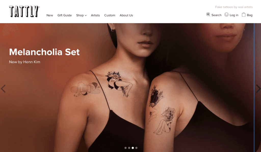
White might be the best color choice for your company if you want to convey a simple, uncluttered feel. In addition to black, white conveys a sense of modernism and can assist create a clean, innocent, and pure appearance.
White, on the other hand, sometimes gives off a hospital-like vibe. Your brand could come across as empty, monotonous, and bland without any color. However, it is context-dependent, just like most colors. White logos are used by some of the world’s most inventive brands, such as Tesla and Apple.
Similar to how white works for Adidas, black works for Nike. Adidas caters to a less athletic demographic of clients than Nike. They frequently collaborate with artists, musicians, and other non-athletes. Thus, white gives them access to a straightforward, global appeal.
#10. Gray
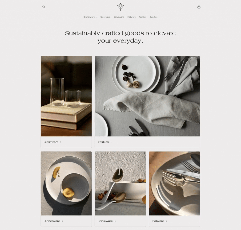
Gray stands for professionalism and practicality. You might think gray is boring, and in a lot of cases, it is. But gray doesn’t have to be boring. With the right marketing strategy, it can also be:
- Neutral
- Professional
- Efficient
- Formal
- Corporate
These are all factors a payroll service would want to emphasize on their invoices. Gray can also show that your brand busts out of the binary, like a website for a progressive children’s clothing brand that wants to set itself apart from the sea of pinks and blues.
Finally, keep in mind that this is just a general overview of different colors. Although some color meanings might be universal, others may differ from culture to culture. That’s why you should think carefully about which colors you use as a part of your marketing, how they might be perceived in different locations, and how you can maximize each of these colors for your benefit.
Choosing The Right Colors For Your Brand
There isn’t just one ideal hue for a brand, so keep that in mind when searching for the right shade. The colors you choose for your marketing strategy, however, are determined by several variables. Although you’re not required to utilize just one color, you can choose to employ a mix of the previously listed hues.
Give considerable thought to your company’s objective, your target market, and the products you sell. Keep in mind that your brand’s identity will be strongly linked to the colors you select. Additionally, someone can be witnessing these hues for the first time, thus it’s best to make a positive impression. Here are a few tips that can help you select the best colors for your business and future marketing materials:
- Ensure colors align with your brand. You need your voice to be consistent across all products, campaigns, marketing materials, and social media channels. That’s why it’s a good idea to think carefully about how specific colors and their meaning fit your business.
- Avoid using more than 3 colors. It’s best not to use more than 3 colors in your branding. Otherwise, your brand voice might appear a bit random, and your target market may have difficulty figuring out what your company stands for. Having too many colors can also affect the visual appearance of your marketing messages or content, making it challenging for your audience to understand your message.
- Select complementary colors. Complementary colors appear opposite on the color wheel and look well together.
- Test your colors. You should test your colors before you make a final decision. See what people think about the color scheme to ensure they have the intended effect.
If you keep these tips in mind, you will be able to easily find the best colors for your marketing campaign.
Ways To Use Color Psychology To Improve Your Marketing
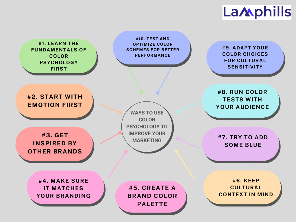
Now that you understand the psychology of color and how important it is to use the appropriate or wrong colors in your marketing, let’s look at how to apply color psychology to increase the effectiveness of your campaigns.
#1. Learn The Fundamentals Of Color Psychology First
Gaining an understanding of color psychology helps you make effective use of it in your marketing. As I previously discussed, blue can have a negative soothing impact, whereas red might cause increased attention or anxiousness.
#2. Start With Emotion First
Whether you’re rethinking your brand colors or deciding on a palette for new ads, you need to start with the emotion you want your audience to have. Should they respond with fear? Curiosity? Confidence? Use these emotional ad copy examples for inspiration. Once you know the desired outcome, make sure to choose the right color.
#3. Get Inspired By Other Brands
Observing how advertisements, websites, and brands use color psychology and noting your reactions to it is the best approach to improving your color psychology skills. Visit Bloomscape, an online retailer of plants catering to Gen Z and Millennial customers.
In the advertisement, Leia is seen lounging in the sun next to a Lego version of Darth Vader. Using these Star Wars figures in a lighthearted setting to create a new narrative is a playful scene. It’s no wonder that the background is orange—an open, inviting color that inspires creativity.
The top bar and text color are forest green, straddling the trendy-earthy spectrum. The pale peach, a warm, imaginative take on Millennial pink, looks great with the cream, a cozy natural accent. Warm terracotta pots contrast with the variety of greens, as do the red and orange highlights on the plants. I’m inspired to water and tend to my plants as a result, and I might even purchase a few succulents.
#4. Make Sure It Matches Your Branding
Only 43% of participants in a study on logo identification by SEO company Reboot were able to identify the company name, although 78% of participants could recall the logo’s primary color.
If your audience remembers your brand by its color, then you want to make sure it’s the same and it’s everywhere. That’s why keeping your colors consistent with your branding is paramount, and the most successful brands recognize this. Remember the Dunkin Donuts rebrand to Dunkin a few years ago? All those image changes, the same old but iconic color choices.
Dunkin’ is a good example because its branding is all over everything—with orange, pink, and brown, as well as variations on these colors. It’s the multiple colors and variations that (in most cases) keep your branding from becoming flat or two-dimensional. This leads us to the next tip—giving yourself the right palette to work with.
#5. Create A Brand Color Palette
This guide below will walk you through the process of choosing a color palette that aligns with your brand values, resonates with your audience, and considers cultural nuances
You want to keep the colors in your marketing consistent, but you don’t want to be forgettable one-note. Worse, this could look spammy. The solution is to have a color scheme to work with that allows for some variety but sets some standards. So if you don’t already have a brand color palette, it’s time to make one. Here are a few common types of color palettes:
- Analogous: Colors next to each other on the color wheel.
- Complementary: opposite colors that create high contrast.
- Monochromatic: Different shades or tones of the same primary color.
If you’re looking for some help coming up with the palette or some inspiration, check out the free design tool Coolors. It contains example pallets and can automatically generate your own based on a starting color or even a photograph.
#6. Keep Cultural Context In Mind
Perception of color isn’t universal. MIT researchers found that the words that we have and use to talk about color vary by language. Some communities have three color categories, while others have up to 12—a significant range in categories—before even getting into individual colors.
It follows that the psychology of color isn’t universal then, either. That’s why it’s important to keep cultural context in mind for your branding and marketing. Here’s an excellent cheat sheet visualization to use as a starting point:
#7. Try To Add Some Blue
At this point, you may be thinking that it’s overwhelming and hard to remember the cultural context, maintain a palette, and rely on the fundamentals of color psychology. Don’t worry. Learning the fundamentals and using color psychology in your marketing process will require some effort and time.
It turns out that the most beloved color in the world by far is blue. That could be one of the explanations for why blue appears in the logos of some of the most well-known companies in the world.
#8. Run Color Tests With Your Audience
Now, this might sound like I’m going against everything before. But the reality is that you can’t always predict how your audience will respond to a certain color—let alone certain shades, tones, or tints in your color palette. That’s where A/B testing comes in. Try testing two different color backgrounds in your ads or buttons on your website and see which your audience prefers.
Then use that information. That’s the best way to leverage color psychology to improve your marketing. Test—and keep testing.
#9. Adapt Your Color Choices for Cultural Sensitivity
It’s always surprising how different cultures perceive colors. I once worked with a beauty brand entering the Asian market, where red is a symbol of luck and prosperity. Their initial ads had a lot of blue, which, while calming, didn’t resonate as strongly with their audience. We shifted the focus to red accents, and their engagement skyrocketed. Cultural
Sensitivity Tips:
- Research your target markets to understand local color preferences.
- Adjust your ads to match cultural expectations and associations.
#10. Test And Optimize Color Schemes For Better Performance
A/B testing is essential to find what color combinations work best. I learned this while working with an e-commerce brand. We tested several colors for their “Add to Cart” button—yellow, green, and orange. Surprisingly, the orange button had a 15% higher conversion rate than the others. It was a lesson in letting the data guide our decisions.
How to Test Colors:
- Use tools like Google Optimize or Hotjar.
- Test different color options for CTAs, backgrounds, and text.
- Make data-driven adjustments to maximize your ad performance.
Conclusion
There you have it: ten effective strategies to include color in your marketing! I have direct experience with how a brand’s reach can be expanded and its audience connected at a deeper level with the use of color. Try out these tactics and observe which ones work best for your brand without fear. Rmember that colors are a way to directly reach your clients’ hearts and are not merely for decoration. Cheers to your successful advertising!
Now that you have decided on your organization’s colors, it’s time to use them. You can easily develop slick websites and Rememberlanding pages, customized marketing emails, and expert e-commerce storefronts with Mailchimp. In addition, being sure that all of your assets, including photos and graphics, are on-brand has never been easier when you use our Content Studio. Get started today to create a consistent brand experience.

