Are you ready to take your small business to the next level? A complete branding package can make all the difference. You’ve got your funding and a great name, but what’s next? Creating your brand identity is important. This means developing a memorable logo, selecting a cohesive color palette, and choosing the right fonts. A branding package bundles all these essential elements together, streamlining the process for you.
With a well-designed branding package, you can enhance your online presence and connect better with customers. Effective branding not only captures attention but also influences purchasing decisions, boosting sales and revenue. So, what exactly should be included in your branding package? In this article, I’ll explore examples, best practices, and everything you need to know about creating a standout branding package. Stick around, and you’ll discover how to build a brand that truly resonates!
Key Takeaways
- Having a solid branding package means that every piece of communication from your company, whether online or offline, speaks the same language.
- Mareiner Holz is a company that specializes in wood products, and uses its packaging to emphasize sustainability and quality.
- The logo is the face of your brand. It’s the first thing people notice.
- Branding creates a unique identity for a company, product, or service. It shapes how consumers perceive and connect with a brand
- Big Bud Press has successfully turned its packaging into a visual representation of its brand’s ethos—celebrating individuality and creativity.
Branding Package
A branding package is like a company’s toolkit for building and maintaining a strong, recognizable identity. It’s not just about having a logo slapped on everything; it’s about crafting a cohesive look and feel that speaks directly to your audience and makes them feel a connection to your brand. Think about the last time you walked into a store or visited a website and instantly knew the brand just by its colors, fonts, or even a familiar tagline. That’s the power of a well-put-together branding package.
At its core, a branding package includes the essentials like a logo, fonts, and a color palette. These are the visual elements that your customers will associate with your brand, whether they see them on your website, social media, or in a physical store. But it’s more than just visuals. It’s also about the messaging—what your brand stands for, your mission, your values, and how you communicate these through slogans or taglines.
For example, when you see a sleek, minimalist logo paired with clean, modern fonts and a specific shade of blue across all materials, you instantly know it’s that tech company you trust. Or when a brand consistently uses a catchy slogan that sums up its promise to you, it sticks in your mind. This consistency isn’t just accidental; it’s meticulously planned out in the branding package. It’s what makes a brand recognizable and trustworthy.
Having a solid branding package means that every piece of communication from your company, whether online or offline, speaks the same language. This builds trust, makes your company stand out, and keeps customers coming back because they know exactly what to expect from your brand. It’s about creating an identity that people don’t just recognize but remember and prefer.
Branding Package Example
When it comes to branding, a well-designed package can make or break a product’s success. A good branding package doesn’t just look pretty—it tells the story of the brand, connects with the target audience, and stands out in a crowded market. Here’s a breakdown of some of the best branding package examples that do exactly that.
#1. Kosan Gas

Kosan Gas shows how a simple, functional product can become a standout brand with the right packaging. Their gas cylinders, typically a mundane item, are transformed into something instantly recognizable through clean, bold design. The branding is straightforward but effective, using bright colors and clear labeling that not only attracts attention but also ensures safety. The clear, no-nonsense approach reflects the brand’s commitment to reliability, making it easy for customers to trust and choose Kosan Gas over competitors.
#2. Mareiner Holz

Mareiner Holz, a company that specializes in wood products, uses its packaging to emphasize sustainability and quality. Their branding package incorporates earthy tones and textures that evoke the natural, organic essence of wood. By using recyclable materials and showcasing the wood’s natural beauty, Mareiner Holz appeals to eco-conscious consumers who value authenticity. Packaging isn’t just about selling a product; it’s about telling the story of where the product comes from and why it matters.
#3. Austrian Biologist Association
For the Austrian Biologist Association, their branding package needed to communicate professionalism and the seriousness of their work. The design uses clean lines, minimalist graphics, and a consistent color scheme that reflects the precision and detail-oriented nature of biology. It’s not flashy, but it’s effective. The branding helps position the association as a leader in the field, conveying trust and expertise—qualities that are crucial for an organization focused on science.
#4. AWSM Sauce
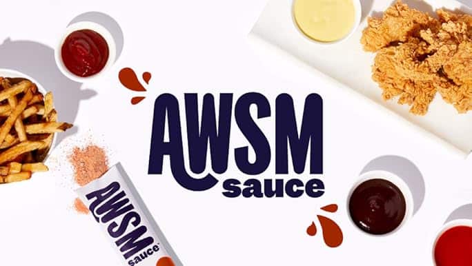
AWSM Sauce took a fun and playful approach to its branding package. Knowing their audience loves bold flavors and unique experiences, they crafted packaging that is vibrant, quirky, and full of personality. The packaging itself feels like an extension of the product, making it clear that AWSM Sauce isn’t just another condiment. It’s something special, something that adds a burst of excitement to meals. The design connects with customers who are looking for something different, making the product memorable and shareable.
#5. Big Bud Press

Big Bud Press is all about inclusivity, color, and fun, and its branding package reflects that. Their packaging is as bold and vibrant as their clothing line, using bright, eye-catching colors that appeal to a diverse and creative audience. The designs are retro yet modern, with a playful vibe that feels approachable. Big Bud Press has successfully turned its packaging into a visual representation of its brand’s ethos—celebrating individuality and creativity.
Here’s a downloadable branding package checklist to ensure your branding package covers all essential elements:
Cost of Branding Package
When you’re looking at the cost of a branding package, it’s not just about the price tag. The cost can range widely, from as low as $1,000 to well over $100,000. It all depends on factors like the size of your company, the scope of the project, and how quickly you need it done.
For instance, if you’re working with a big branding agency in New York City, you’re likely looking at a minimum campaign size of about $13,000. But if you head to Florida, you might find top agencies offering their services for around $3,800 on average. The location of the agency plays a big role in pricing. This isn’t just about geography, though; it also reflects the cost of living, demand, and the type of clients these agencies typically serve.
Now, the size of the agency also impacts the cost. Larger, full-service agencies that can handle everything from branding to marketing campaigns tend to be more expensive. They have more overhead, more staff, and offer a broader range of services, which all add up. On the other hand, smaller agencies or freelance designers might offer more affordable rates. Freelancers, in particular, often charge by the hour, and their rates can range from $80 to $120. This is usually less than what you’d pay at a large agency, making them a good option for businesses with tighter budgets.
For companies looking to balance quality and cost, services like Duck. Design offers a competitive alternative. For $1,599 per month, you get access to various graphic designs tailored to your daily marketing needs. This kind of subscription model can be especially appealing if you need ongoing design work but don’t want to commit to a massive upfront investment.
In summary, the cost of a branding package varies widely depending on your needs and the agency you choose. Whether you go with a big-name agency or a freelance designer, it’s crucial to understand what you’re paying for and how it fits into your overall branding strategy.
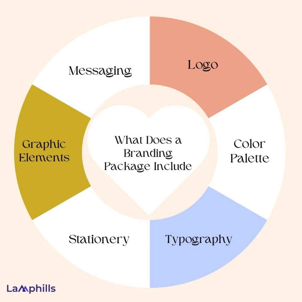
What Does a Branding Package Include?
A branding package is essential for establishing a strong identity for your business. Let’s break down what it includes and why each component matters.
#1. Logo
The logo is the face of your brand. It’s the first thing people notice. Take Nike, for example. Their swoosh is simple yet instantly recognizable. When you design your logo, aim for something memorable and reflective of your brand’s values. A well-crafted logo can communicate your message without saying a word.
Furthermore, a logo isn’t just a pretty design, it encapsulates your brand’s essence. Think of it as the first handshake your business makes. It should tell your story at a glance. Another example is Starbucks’ logo which has evolved, but its core elements—green and the mermaid—remain. This consistency reinforces brand recognition globally. When designing your logo, consider its versatility. It should work well on various backgrounds and scales, from business cards to billboards.
#2. Color Palette
Colors evoke emotions. They can make your audience feel trust, excitement, or calm. Think about McDonald’s—red and yellow create a sense of hunger and happiness. When choosing a color palette, consider how each color aligns with your brand personality. A cohesive palette can enhance recognition and create a consistent feel across all platforms.
Creating a palette involves choosing primary and secondary colors that complement each other. Test combinations in different contexts to see how they resonate. A well-chosen palette can unify your branding across all platforms, from social media to product packaging.
#3. Typography
Typography shapes how your brand communicates. The right font can convey professionalism or playfulness. For instance, a law firm might choose a classic serif font for seriousness, while a children’s toy brand could opt for a fun, rounded typeface. Consistent typography across materials reinforces your brand identity and ensures readability. Different typefaces can convey distinct personalities:
- Script fonts convey elegance and creativity.
- Serif fonts (like Times New Roman) suggest tradition and reliability.
- Sans-serif fonts (like Arial) feel modern and approachable.
#4. Stationery
Stationery isn’t just functional; it’s an opportunity to reinforce your brand identity. When potential clients receive a letter from you, the quality and design of your stationery leave an impression. A high-quality business card printed on thick paper with a matte finish feels professional and luxurious, enhancing your brand’s credibility.
Consider adding unique touches, like embossing your logo or using colored envelopes. These small details can set you apart and create memorable experiences.
#5. Graphic Elements
Graphic elements add flair and help tell your brand’s story visually. Think of these as the embellishments that enhance your brand narrative. Patterns can be used in backgrounds or packaging, while icons can simplify complex ideas—think of how Slack uses icons to make communication more intuitive.
Creating a consistent set of graphic elements can make your branding feel cohesive across different platforms, from your website to social media and printed materials. These elements also allow for creative storytelling; for instance, you might use graphics in a presentation to illustrate your brand’s journey.
#6. Messaging
Your messaging is the voice of your brand. It should reflect your values and resonate with your audience. For instance, if your brand prioritizes sustainability, your messaging should highlight eco-friendly practices.
Develop a clear tagline that summarizes your mission in a few memorable words. Consider how you want to speak to your audience: will your tone be formal, friendly, or playful? Crafting a brand voice guide can help maintain consistency in all communications, from social media posts to customer service interactions.
How To Put together a Branding Package?
Creating a branding package is essential for establishing a strong identity. Here’s a straightforward guide based on real experience.
- Assess Your Current Brand Identity: Start by evaluating what your brand stands for. Look at your mission, values, and overall message. Understanding where you currently are helps you decide where you want to go.
- Research Your Target Audience: Get to know your audience. What do they like? What problems do they face? Tailoring your brand to meet their needs is crucial. Use surveys, social media, or direct conversations to gather insights.
- Audit Your Competitors: Look at your competitors. Analyze their branding—logos, colors, messaging. Identify what works and what doesn’t. This helps you find a unique angle for your brand.
- Create a Brand Story: Develop a compelling brand story. This is your chance to connect emotionally with your audience. Share your journey, your mission, and what sets you apart. A good story makes your brand relatable.
- Design Your Logo: Your logo is the face of your brand. It should be simple, memorable, and reflect your brand’s identity. Spend time brainstorming and sketching ideas. Consider getting feedback before finalizing it.
- Choose Your Color Palette: Colors evoke emotions. Select a palette that resonates with your brand’s personality. For example, blue often represents trust, while green can signify growth. Consistency in color enhances brand recognition.
- Choose Your Typography: Typography affects how your message is perceived. Choose fonts that match your brand’s tone. For a playful brand, consider fun, rounded fonts. For a serious brand, opt for clean, professional types.
What Is the Difference Between Branding and Labelling?
Branding and labeling serve different but important roles in the marketplace. Branding creates a unique identity for a company, product, or service. It shapes how consumers perceive and connect with a brand. Think of it as the personality that represents what a business stands for. Branding establishes a reputation, conveys values, and builds trust.
On the other hand, labeling focuses on specific information about a product. It provides details like ingredients, usage instructions, and safety warnings. Labels inform consumers about what they are buying, helping them make informed choices.
In short, branding is about the overall impression and emotional connection. Labeling delivers the essential facts. Both are crucial. Branding builds a lasting identity, while labeling offers clarity and transparency.
Is Branded Packaging Worth It?
Branded packaging is worth it. It’s more than just a pretty box; it plays a crucial role in marketing. First, think about the impact of unboxing. When customers receive a beautifully branded package, it creates excitement. That excitement builds a connection with the brand, making them more likely to share their experience online.
Branded packaging also helps differentiate your product. In a crowded market, it catches the eye. A unique design can stand out on shelves and online, attracting more customers. Moreover, branded packaging builds trust. Customers often associate high-quality packaging with high-quality products. This trust can lead to repeat purchases, boosting long-term loyalty.
Finally, consider the potential for sustainability. Many brands are now using eco-friendly materials. This not only appeals to environmentally conscious consumers but also enhances your brand’s image. In short, branded packaging is worth it. It creates excitement, sets you apart, builds trust, and can even support sustainability efforts.
Related Articles
- Branding Process: A Step-by-Step Breakdown
- 7 Types of Branding: How to Choose the Right Strategy for Your Business
- Branding vs. Packaging: Key Strategies for Standing Out in Nigeria’s Market
