
A logo isn’t just a visual element—it’s the embodiment of a brand’s identity. In line with branding, I’ve witnessed firsthand the profound impact of well-crafted logos on a company’s success. Paul Rand once remarked, “Design is the silent ambassador of your brand.” This sentiment resonates deeply with me; in fact, it must be part of your branding journey. Logos like Apple’s iconic apple or Nike’s swoosh have transcended their visual forms to become global symbols of innovation, performance, and trust. Today, we’ll explore the compelling stories behind some of the most famous logos in history to uncover strategies that anyone can apply to create an effective and memorable logo for their brand.
Key Points
- A logo isn’t just a visual element—it’s a brand’s identity.
- Research from Nielsen Norman Group highlights that the left side of a page is the prime spot for logo placement.
- The seven main types of logos are monogram logos (letter marks), wordmark logos, pictorial marks (logo symbols), abstract logos, mascot logos, combination marks, and emblem logos.
- The stories behind famous logos offer valuable lessons in effective branding and design.
- Design is the silent ambassador of your brand.
The Stories Behind the Famous Logos
Let’s take a look at some famous logos and some of the stories behind them:
#1. Apple: The Bite of Innovation
The Apple brand logo is one design I’ve observed over the years. When Rob Janoff designed the Apple logo in 1977, he opted for a simple apple with a bite taken out. The bite served a practical purpose: to make sure the apple was easily recognizable and not mistaken for a cherry or a tomato. Over the decades, Apple has refined its logo from a multi-colored apple to a sophisticated monochrome design, reflecting its commitment to simplicity as well as technological advancement. This evolution underscores the importance of a logo that adapts while staying true to its core identity.
From this story, we can deduce that simplicity in design has a profound impact. Apple’s logo demonstrates that a minimalist approach can still symbolize innovation and elegance. It’s a powerful reminder that sometimes less is more, especially when creating a memorable brand identity.
#2. Nike: The Swoosh of Speed
Nike’s swoosh, crafted by Carolyn Davidson in 1971, is another prime example of effective branding. The swoosh symbolizes motion and speed, inspired by the Greek goddess Nike, and has become synonymous with athletic excellence. The swoosh’s simplicity and dynamic form are key to its success. It shows how a clean, impactful design can resonate deeply with consumers. Simple designs can also become a powerful brand asset.
While the simplicity of this logo is intriguing, initially, it was met with skepticism from Nike’s founders. Today, the swoosh is one of the most recognizable symbols in sports and fashion, symbolizing performance and energy. It incorporated elements that resonate deeply with the brand’s core values. Moreover, the swoosh’s dynamic shape and association with the goddess of victory illustrate how a well-thought-out design can become a powerful emblem of athletic excellence and brand identity.
#3. Coca-Cola: The Script of Heritage
Coca-Cola’s script logo, created in 1887, has maintained its classic appearance for over a century. The flowing Spencerian script reflects the brand’s heritage as well as its enduring appeal. In my experience, maintaining a consistent logo design helps build a strong, recognizable brand identity, as evidenced by Coca-Cola’s continued global success. The Coca-Cola logo also teaches that consistency in logo design fosters brand recognition and trust. Additionally, it highlights the importance of maintaining a coherent visual identity to build long-term consumer connections and reinforce brand heritage.
#4. IBM: The Stripes of Innovation
Paul Rand’s design of IBM’s 8-bar logo in 1972 is a testament to strategic branding. The horizontal stripes represent IBM’s commitment to innovation and stability, a principle I’ve seen many successful companies adopt. Rand’s timeless design has been instrumental in reinforcing IBM’s reputation as a technology leader. This logo exemplifies how thoughtful design can communicate a brand’s core values. The IBM logo also proves that thoughtful designs communicate a brand’s core attributes.
#5. Amazon: The Smile of Satisfaction
Amazon’s logo, introduced in 2000, features a smiling arrow that stretches from A to Z. This design element represents Amazon’s commitment to providing a vast range of products—from A to Z—and ensuring customer satisfaction. Secondly, the smile conveys a positive customer experience, aligning with Amazon’s focus on making shopping enjoyable and reliable.
#6. McDonald’s: The Golden Arches of Consistency
The golden arches of McDonald’s, which began as a simple architectural feature, have evolved into one of the most recognizable symbols worldwide. The arches’ design, originally intended to draw attention, now represents quality and consistency. If there’s any lesson I learned from this, it’s that a distinctive and consistent logo can solidify a brand’s presence and convey a clear message of reliability and familiarity. Additionally, a logo can evolve from a practical element to a powerful brand symbol.
#7. FedEx: The Hidden Arrow of Precision
The FedEx logo, designed by Lindon Leader in 1994, features a hidden arrow between the “E” and “X,” symbolizing speed and precision. This clever use of negative space highlights the importance of embedding meaningful elements into your logo design. From my perspective, incorporating subtle yet impactful details can enhance a brand’s message. Secondly, it creates memorable impressions. The FedEx logo reveals that incorporating subtle design elements can enhance a logo’s meaning and effectiveness.
The Stories Behind Famous Logos: Key Lessons from Famous Logos
The following are a few lessons from the stories behind famous brands’ logos:
#1. Simplicity is Key
One of the things I’ve learned from the stories of famous logos is that simplicity is often the most effective approach in logo design. Logos like Apple’s and Nike’s prove that straightforward, clear design is memorable. It’s also versatile across various applications. Moreover, keeping the design simple ensures that it remains effective and recognizable in any context.
#2. Consistency Builds Recognition
The consistent use of logos, as seen with Coca-Cola and IBM, builds brand recognition. Generally, a well-maintained logo fosters trust and long-term loyalty among consumers. In my work, I’ve found that brands that uphold a consistent visual identity are more successful in establishing a strong market presence.
#3. Symbolism and Storytelling
Effective logos often incorporate symbolism that aligns with the brand’s story and values. For instance, FedEx’s hidden arrow is a prime example of how a logo can convey deeper meanings and reinforce the brand’s core message. My firsthand experience underscores the value of integrating thoughtful symbolism into your logo design to strengthen your brand’s narrative.
How to Apply These Lessons to Your Brand
If you have a brand you intend to nurture or grow, you can apply these lessons in the following ways:
#1. Building a Brand Identity
Ensure your logo aligns with your brand’s core values and messaging. A logo that accurately reflects your brand’s mission and resonates with your target audience will build a stronger connection. It also establishes a more impactful brand identity.
#2. Design Tips
I always prioritize simplicity and clarity when designing a logo. Why? A versatile design that works across different sizes and formats will enhance effectiveness and adaptability.
What Are the Top 10 Most Recognizable Logos?
The top 10 most recognizable logos are often those of companies that have achieved global success and maintain a strong brand presence. The following are some of the most iconic logos:
- Apple
- Nike
- Coca-Cola
- McDonald’s
- Microsoft
- Mercedes-Benz
- Adidas
- Starbucks
- Amazon
What Are the 7 Types of Logos?
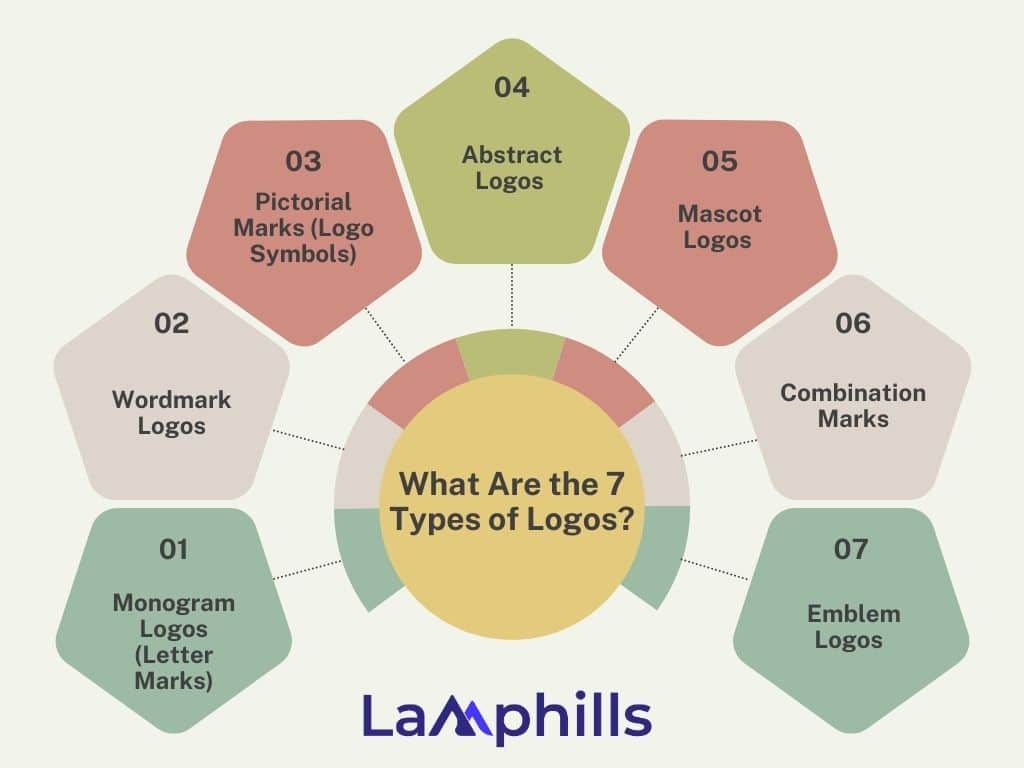
The seven main types of logos are monogram logos (letter marks), wordmark logos, pictorial marks (logo symbols), abstract logos, mascot logos, combination marks, and emblem logos. These are often categorized based on their visual elements and how they represent a brand.
What Is the Most Iconic Logo Ever?
I may have to settle for the Coca-Cola logo; its timeless red and white script has remained largely unchanged since its creation in the late 19th century, making it instantly recognizable worldwide. However, there is more than one iconic logo across the globe.
What Is the Reverse Logo?
A reverse logo refers to a version of a logo designed to be used on a dark or colored background, as opposed to the standard light or white background. In a reverse logo, the colors of the logo elements, such as text and symbols, are often inverted or altered to ensure the logo remains visible and retains its identity against a darker background.
Should a Logo Be on the Right or Left?
Research from Nielsen Norman Group highlights that the left side of a page is the prime spot for logo placement. Interestingly, logos at the top left corner are significantly more memorable, with users being 89% more likely to recall them than those on the right side.
Famous Logo Designers
Having looked at the stories behind famous logos and deduced lessons from them, let’s consider a few amazing designers who brought those logos to life.
#1. Apple
The iconic Apple logo was designed by Rob Janoff in 1977. Rob Janoff designed the original Apple logo featuring a bitten apple, which has evolved but remains a powerful symbol of innovation and simplicity.
#2. Nike
Nike’s logo was designed by Carolyn Davidson in 1971. Carolyn Davidson created the Nike swoosh, inspired by the Greek goddess Nike’s wing, symbolizing speed and movement. This design has become one of the most recognizable logos in sports.
#3. McDonald’s
The McDonald’s Golden Arches were designed by Jim Schindler in 1962. The Golden Arches were adopted as the brand’s logo due to their distinctive shape and visibility. Jim Schindler played a significant role in incorporating them into McDonald’s branding.
#4. IBM
The IBM logo was designed by Paul Rand in 1972. Paul Rand designed the IBM 8-bar logo, using horizontal stripes to convey a sense of stability as well as innovation. Rand’s design has become a classic example of corporate branding.
#5. Coca-Cola
The iconic Coca-Cola logo was designed by Frank M. Robinson in 1887 using Spencerian script. This timeless design has become an enduring symbol of the brand’s heritage and consistency.
#6. FedEx
Lindon Leader designed the FedEx logo in 1994. It features a hidden arrow between the “E” and “X,” symbolizing speed and precision. This clever use of negative space has made the logo functional and memorable.
#7. Amazon
Turner Duckworth designed the Amazon logo in 2000. Using a smiley arrow that stretches from A to Z, he symbolized Amazon’s extensive product range and commitment to customer satisfaction.
Lamphills’ Logo Design Checklist
Want to brand your product or service? It begins with creating a unique design. This will serve as your brand’s identity.
Download Lamphills’ Logo Design Checklist
Conclusion
The stories behind famous logos offer valuable lessons in effective branding and design. Most of these brands have withstood the test of time. They have unwavering credibility, and you can apply the lesson behind these stories to your branding efforts. Why do I recommend this in branding? Designing a simple, consistent, and meaningful logo will help establish a strong brand identity and leave a lasting impression on your audience.
Related Articles
- Top CSR Brands: 11+ Inspiring Examples of Corporate Social Responsibility
- What Are Transparent Brands?: Why They Matter and What We Can Learn From Them
- Small Business Branding Ideas: 15 Creative Ideas for 2024
- How to Monetize Instagram: Turn Your Instagram to Income