Every year, graphic design trends show us how art can imitate life. These trends reflect our ever-changing needs and perspectives as a society. In 2024, we’re seeing graphic designers dive head-first into diversity and inclusion, 3D surrealism, and start to dip their toes into the world of AI-powered design.
From the warm feelings of nostalgia to the chilling look of cyber realism and loaded compositions, 2024 design trends clash with machine advancements and human comforts. Strap in because this article has your go-to cheat sheet for staying ahead of the design game.
Key Points
- Graphic design trends evolve to mirror societal shifts and technological advancements, ensuring designs stay relevant and resonate with contemporary audiences.
- AI-powered design tools are becoming essential, enhancing creativity and streamlining workflows without replacing the designer’s unique touch.
- Trends like retro pixels, 70s nostalgia, and scrapbooking blend past aesthetics with modern sensibilities, creating a unique and emotionally resonant visual language.
- Minimalism remains a key trend, proving that a clean, purposeful design can effectively communicate messages in an increasingly cluttered digital landscape.
- Staying abreast of trends not only keeps designs fresh but also inspires new creative directions and solutions, fostering continuous innovation in the field.
Why Graphic Design Trends Matter
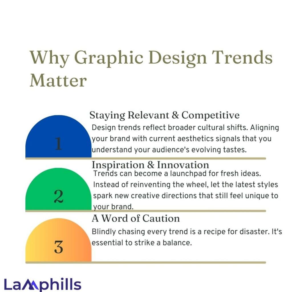
Graphic design trends help you create projects that promptly communicate and connect to your audience. By following and understanding trends, you’re communicating to your audience that you are plugged into the graphic design world and engaged with how consumer interests are evolving.
As writer and activist Toni Cade Bambara said, “The role of the artist is to make revolution irresistible.” In other words, graphic design trends aren’t only signs of the times; they’re sometimes a catalyst to change themselves! Below are more reasons why graphic design trends matter in 2024.
#1. Staying Relevant & Competitive
Design trends reflect broader cultural shifts. Aligning your brand with current aesthetics signals that you understand your audience’s evolving tastes. If your competitors keep updating their look while yours languishes, they appear more enticing.
#2. Inspiration & Innovation
Trends can become a launchpad for fresh ideas. Instead of reinventing the wheel, let the latest styles spark new creative directions that still feel unique to your brand. Observing what works for others often inspires unexpected solutions to design challenges.
#3. A Word of Caution
Blindly chasing every trend is a recipe for disaster. It’s essential to strike a balance. The goal is to incorporate trending elements tastefully in a way that complements your established brand identity rather than trying to become a carbon copy of what everyone else is doing.
Understanding why trends matter helps us leverage them intelligently for business growth without sacrificing our distinct voice.
15 Graphic Design Trends to Look Out for in 2024
Now, let’s be clear: following these trends is not mandatory. Individuality will always reign supreme; your designs should scream “you” above all else. A little predictive analysis never hurts anybody—here are the 15 best trends in graphic design to keep on your radar:
#1. Bold Minimalism
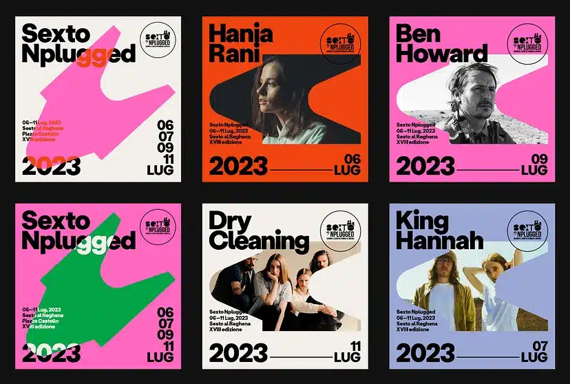
Minimalism, a timeless and enduring graphic design trend of 2024, will never go out of fashion. This “less is more” philosophy has recently gained even more prominence. In this approach, every element in the design serves a purpose, stripping away the unnecessary to reveal the essence. Clean lines, ample white space, and an uncluttered aesthetic characterize minimalist designs.
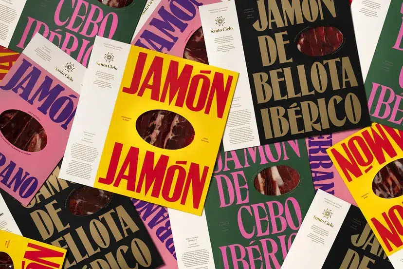
This trend promotes efficient communication by bringing a sense of elegance and simplicity to the forefront. With a limited colour palette and a focus on typography, minimalism allows designers to convey a message precisely. Its adaptability to various mediums, from websites to branding, makes it a versatile choice for design projects. As we journey through 2024, minimalism reminds us that sometimes, in a world filled with noise, a whisper can be far more powerful than a shout.
#2. Retro Pixels
Remember the chunky heroes and vibrant landscapes of your childhood? They’re back!
Pixel art is making a charming comeback, infusing designs with nostalgic fun. Get ready for blocky buddies gracing everything from branding to websites, 8-bit worlds transporting you to classic video games, and subtle game-inspired elements adding a playful wink.
This retro aesthetic, infused with a modern twist, injects a playful nostalgia into branding, website design, and packaging.
Pizza Hut took us back to the arcade era with its “Pac-Man x Pizza Hut” collaboration, which featured pixelated pizzas and Pac-Man-themed packaging.
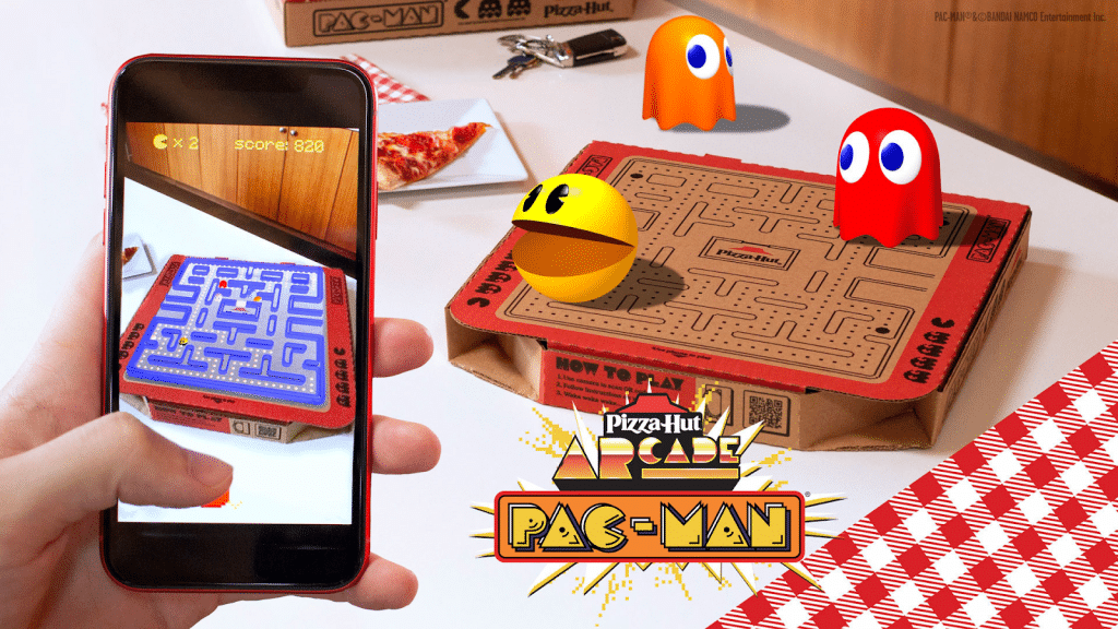
Pixel art isn’t just about looking retro; it’s about celebrating simplicity and limitations, proving that sometimes the most captivating visuals are born from constraints, not abundance.
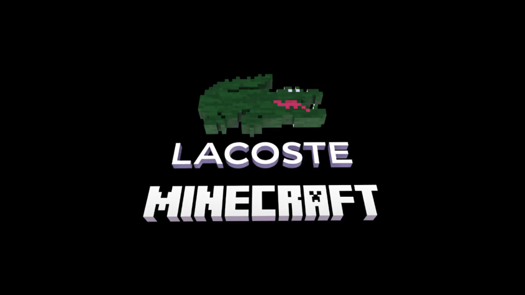
Take Lacoste, for example. The iconic crocodile got a pixelated makeover for their collaboration with Minecraft, celebrating nostalgia and gaming culture.
Its inherent simplicity and vibrant charm resonate with audiences across generations, offering a welcome respite from the hyper-realism of many contemporary visuals.
#3. Inclusive Visuals
In 2024, graphic design embraces its responsibility to reflect the true diversity of the world around us.
Gone are the days of generic, faceless figures representing “everyone.” Instead, designers incorporate visual elements celebrating a broader spectrum of races, ethnicities, genders, abilities, and body types.
This commitment to inclusivity goes beyond mere representation; it’s about creating visuals that resonate with the lived experiences of diverse audiences. Google’s updated emoji library now includes a more comprehensive range of skin tones, hairstyles, and gender expressions, representing broader identities.
To diversify our digital world, Scope, a UK-based disability charity, released 18 new emoji icons representing people with disabilities and the inspiring world of Paralympic sports.
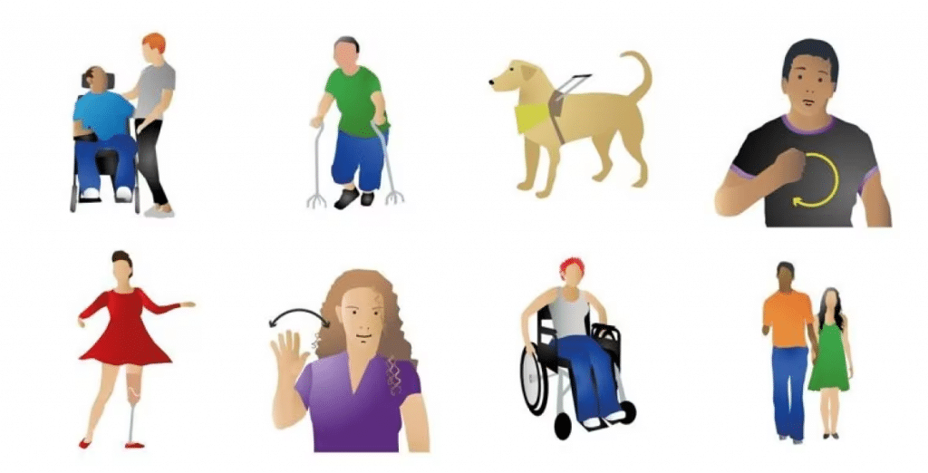
Designers also prioritize accessibility, ensuring their visuals are usable by people with visual impairments or cognitive disabilities. This shift towards inclusivity isn’t just about trends; it’s about recognizing the power of design to build empathy, understanding, and a sense of belonging in the world we share.
#4. Scrapbooking
Ah, the joy of sifting through a childhood scrapbook, its pages overflowing with memories, textures, and handwritten notes.
Well, that nostalgic charm is about to infuse graphic designs in 2024. Imagine a website adorned with polaroid-inspired textures; its text penned in a whimsical, hand-drawn font. Or picture a brochure layered with vintage ephemera, each element echoing the tactile joy of physical memories.
This trend isn’t just about aesthetics; it’s about evoking emotions, fostering connections, and inviting you to peek into the designer’s scrapbook of inspiration.
Spotify’s annual “Wrapped” in 2023 celebrated user listening habits with personalized, shareable graphics that felt like customized digital scrapbooks. Each user received a unique collage of their top artists, genres, and songs, with playful illustrations and witty captions.
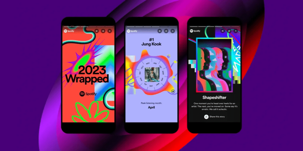
The scrapbooking design trend celebrates individuality, rejects sterile perfection, and embraces the imperfections that make our stories unique.
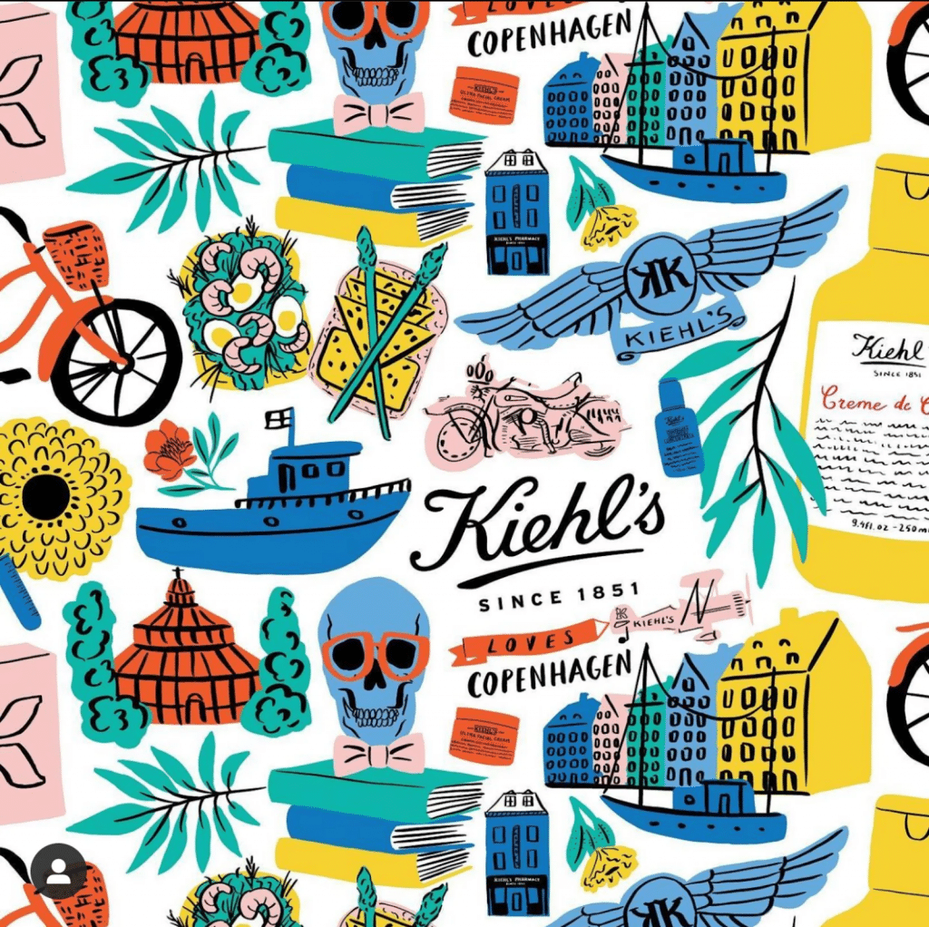
Kiehl’s is also all about that scrapbooking flair in their packaging and design. The skincare brand frequently incorporates vintage botanical drawings and handwritten labels into its packaging, giving it a nostalgic scrapbook charm.
#5. 70s Nostalgia
Last year, Y2K brought back glitter, gaudiness, and, worst of all, low-rise jeans. But designers look to the funky 60s and 70s this year for nostalgic relief. This is one of the top graphic design trends you’ll see this year. Think of faded retro colour palettes, handmade illustrations, and a focus on the human touch to designs.
In 2024, people are clinging to the simplicity of older times. With all this talk of AI, quantum computing, and the end of the world as we know it, designers and people alike need a break from technological advancement. Que the rise of Polaroid cameras and film—and regression to simpler graphics and colours.
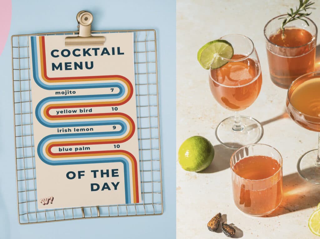
Unlike the unhinged look of Y2K designs, these retro designs are more earthy. Think of retro stripes, floral or funky patterns, and a laid-back look and feel. Re-watch some ’70s classics to get into the vibe of the golden years.
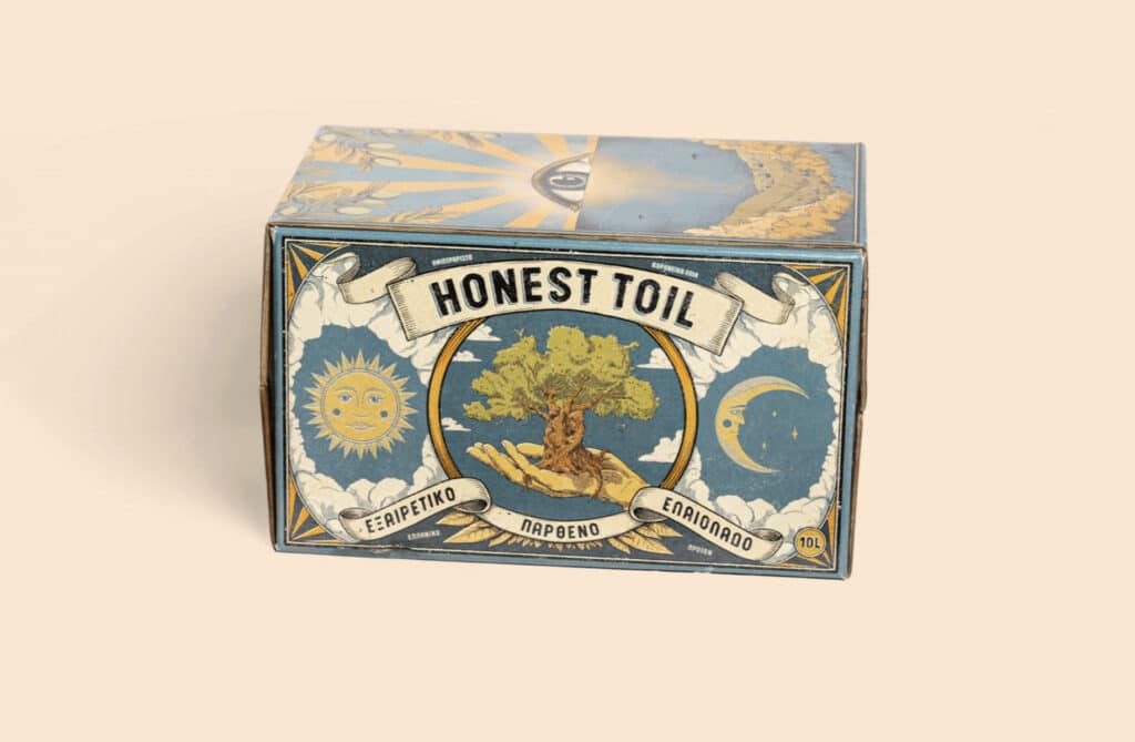
You’ll see a revival of vintage art designs, retro stripes, and checkers all over branding and graphics. 2024 is embracing the look of older designs in new ways!
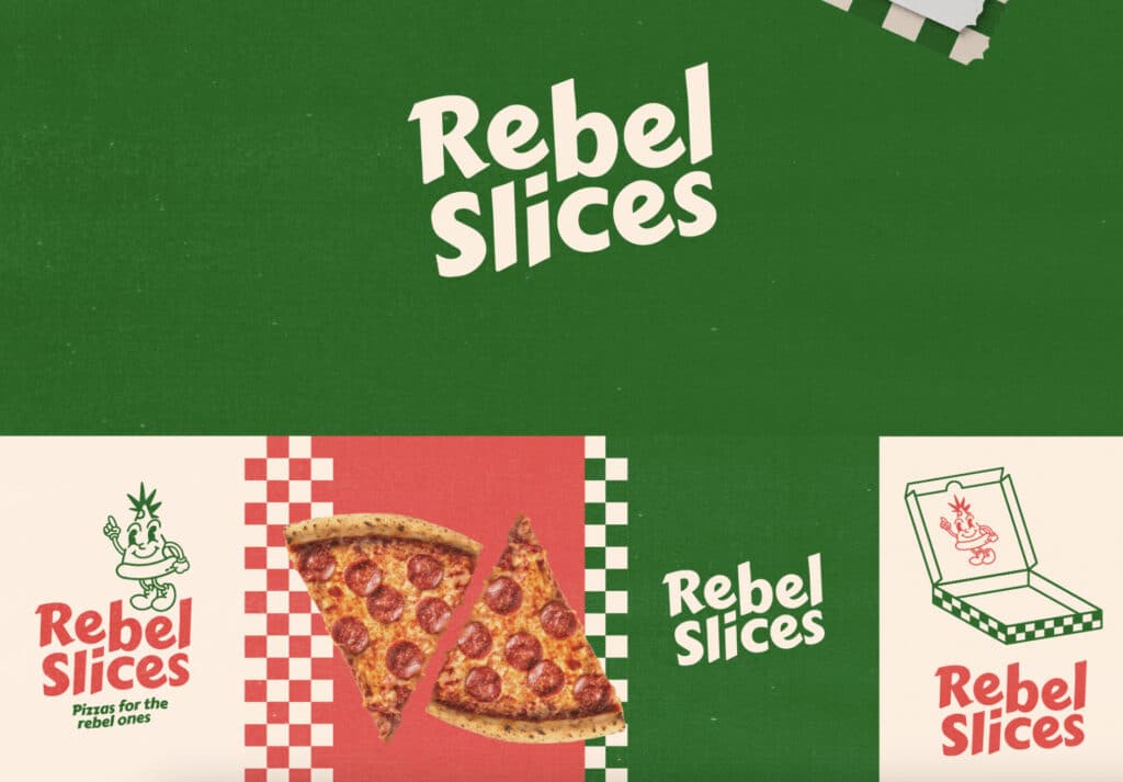
The graphic design industry often evolves in tandem with fashion, beauty, and interior design. Jumping on this trend signals your audience that you are present and engaged with up-and-coming design styles.
#6. Maximalism
Maximalism, the design movement known for its explosion of colour, pattern, and texture, will return in 2024.
This trend is about embracing the more-is-more mentality, creating visually stimulating and unapologetically fun designs.
Maximalism explodes your brand narrative onto the scene, forging instant emotional connections with intricate details and captivating visuals.
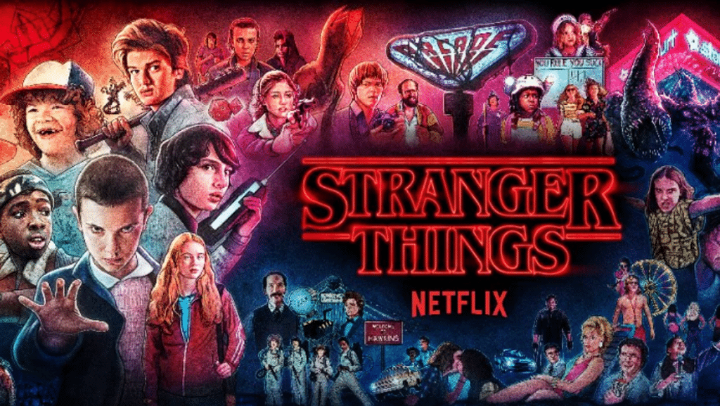
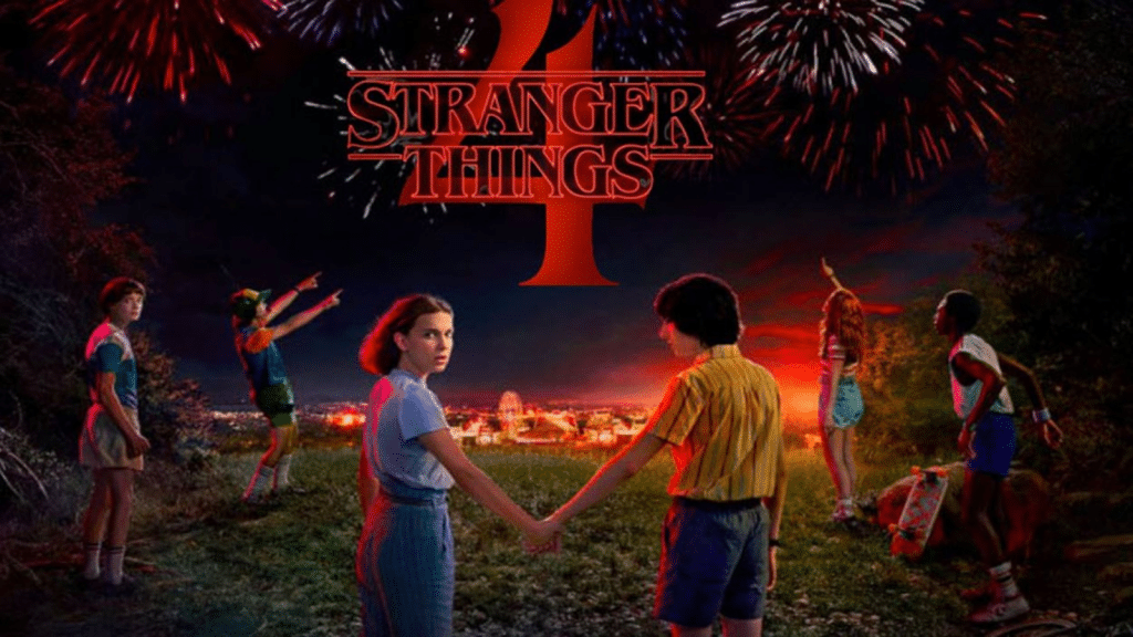
Season 4 of Netflix’s “Stranger Things” wasn’t just a trip down memory lane; it was a maximalist joyride through the neon-drenched streets of 1980s Hawkins.
Its marketing campaign embraced the show’s retro 80s aesthetic with neon colors, bold typography, and layered visual elements. Posters, billboards, and even physical pop-up installations transported fans back to the world of Hawkins in a maximalist way.
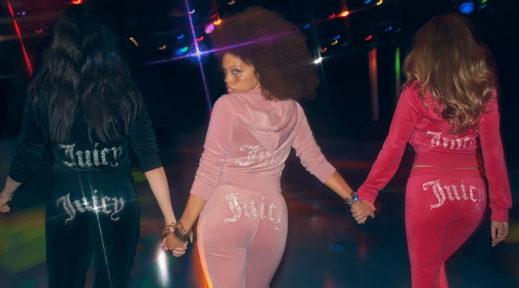
Graphic design aside, this trend brought back the early 2000s obsession with maximalism with its bright colours, holographic accents, and playful patterns. Brands like Juicy Couture and Von Dutch saw a resurgence, and social media platforms like TikTok were flooded with Y2K fashion inspiration.
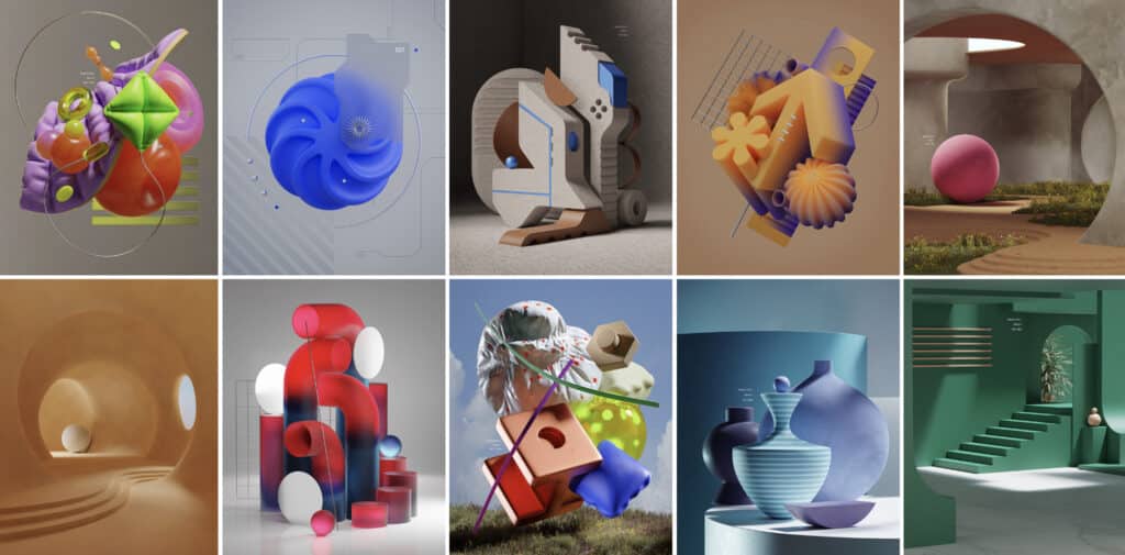
#7. 3D Surrealism
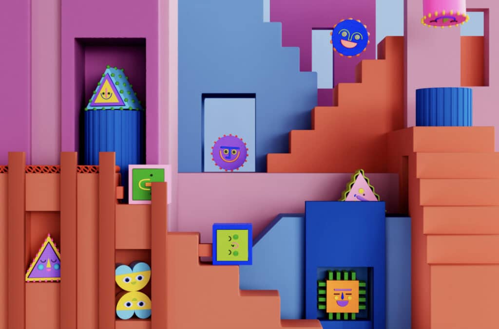
The rise of AI technology and tools has herded in a new graphic design trend. Surrealistic settings, products, and environments are coming in hot as tech in 2024 takes leaps and bounds into the future. These designs have an inflatable, 3D look that feels straight out of Cyberpunk.
AI tools like Midjourney and Open AI make these visuals accessible at cyber speeds. This graphic design trend is ideal for ads, posters, social media, and web design. Reddit’s 2024 rebrand is the first brand to embody this trend with its 3D mascot and logo symbol.
#8. Patterns & Abstract Gradients
Gradients are making a bold comeback. This graphic design trend seamlessly blends colours from one shade to another, creating mesmerizing transitions that add depth and dimension to designs. Gradients are versatile, lending themselves to various applications, from backgrounds to typography and logos.
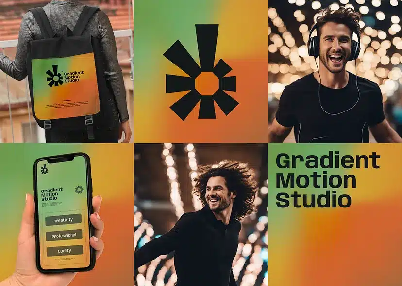
Gradients are the perfect way to spice up your backgrounds instead of using plain background colours. The visual of a gradient is so solid and recognizable that it can even be a central element in your brand identity. So, whether it’s a subtle fade or a striking colour shift, expect gradients to add an extra layer of visual intrigue to design projects in the year ahead.
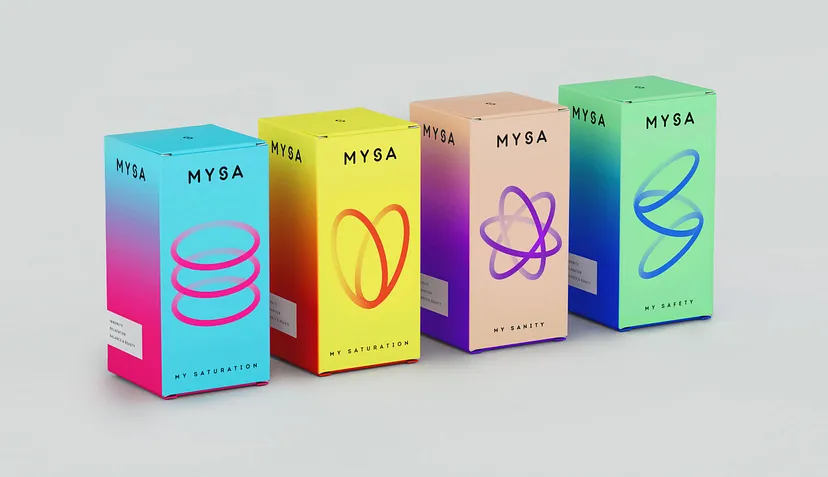
Like gradient patterns, a captivating graphic design trend in 2024, is a great way to bring character to a design. From intricate geometrics to playful florals, designers are embracing patterns to add depth, character, and a touch of nostalgia to their creations. In today’s digital age, patterns connect us to tradition while allowing endless creative exploration. They offer a canvas for storytelling, from minimalistic elegance to vibrant whimsy.
More and more designers are starting to make pattern creation their main focus by working on commissioned projects or selling them on digital marketplaces. Brands are realizing the power of custom patterns on their branded wrapping paper, tissue paper, or anything else. A custom pattern is another asset for a brand to communicate its story to customers.
#9. Utilitarian Design
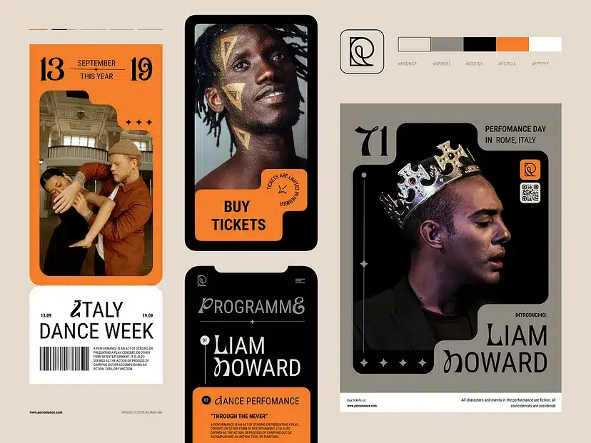
Utilitarian design is all about functionality. This design trend has been gaining popularity this year as we move into an increasingly digital world. With so much of our lives online, websites and apps must be easy to use and navigate.
Utilitarian design is focused on simplifying user experience by removing unnecessary elements. This can be achieved through minimalism, straightforward navigation, and easy-to-understand content.
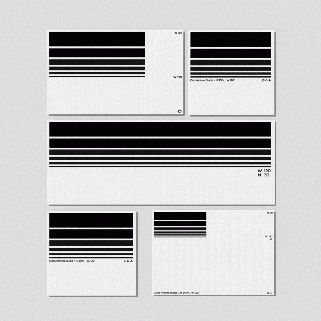
Designing something in this style immediately creates a certain boldness and trust in quality. This trend has recognizable elements found in vehicles, tools, and manuals.
#10. Heatmapping
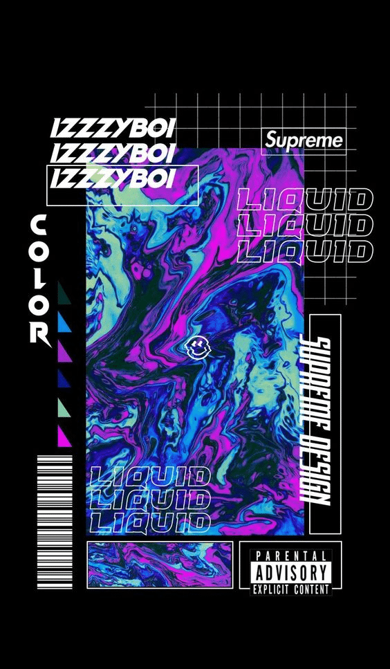
Those mesmerizing science chart swirls? They’re shedding their lab coats and joining the party! Get ready to see this trend everywhere, from social media graphics to packaging design.
Heatmapping adds depth and dimension to graphic design, drawing viewers in and captivating their attention. It’s perfect for creating eye-catching branding, dynamic posters, and immersive web interfaces.
Graphic designers increasingly incorporate heatmap-like colour gradients and textures into their work, creating visually exciting patterns and conveying data visualization aesthetically pleasingly.
#11. Experimental Typography
Forget neatly aligned, predictable fonts. In 2024, typography transforms into a playground of experimentation.
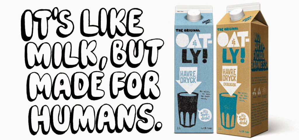
Experimental typefaces include anything slightly different, including fonts with edgy and funky lines or strokes, animation, 3D elements, colour, illustrations, and variable styling. They are identifiable because you can’t look at these typefaces and pinpoint a name or exact style for them.
Remember the playful, uneven logo that shook up the dairy alternative scene? Oatly embraced an “anti-perfect” aesthetic, reflecting their playful and sustainable values.
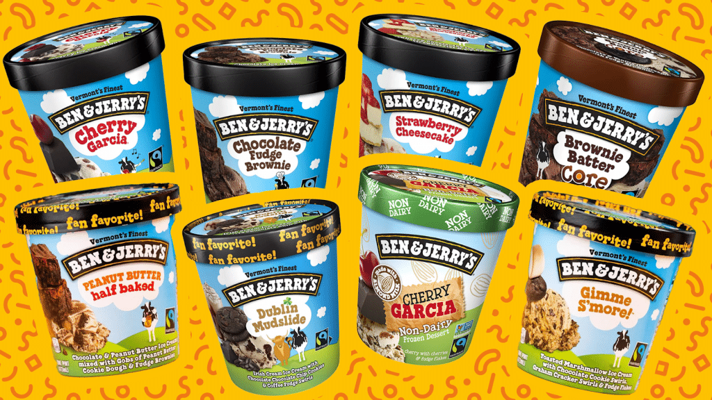
They’re not the only ones with playful packaging—Ben & Jerry’s embraces hand-drawn and textured typography that reflects its quirky and fun-loving brand.
Think of a graffiti artist wielding letters like spray cans, creating captivating murals of words. Or envision a playful dance of animated typography, where each letter pirouettes across the screen, imbuing the message with dynamic energy.
This isn’t just about legibility; it’s about pushing the boundaries of form and function, injecting personality into every character.
#12. Vintage Minimalism
This year’s rendition of the vintage trend features a simple vintage colour palette paired with a retro font. Think of visiting a centuries-old apothecary or perfumer in ancient times. This trend channels the look and feel of a typewriter label, a wax stamp, and hand-drawn instructions on labels.
But the fun doesn’t end there. Use any vintage-era elements, but keep them minimal and striking. Designers are adding a twist by removing most elements and keeping them minimalistic.


Keep font pairs minimal and use a modern font to add an edgy element, like the olive oil branding below. This trend is significant for projects that want to capture the playfulness of the 1970s while showcasing a modern element. It’s an outstanding balance of past and present!

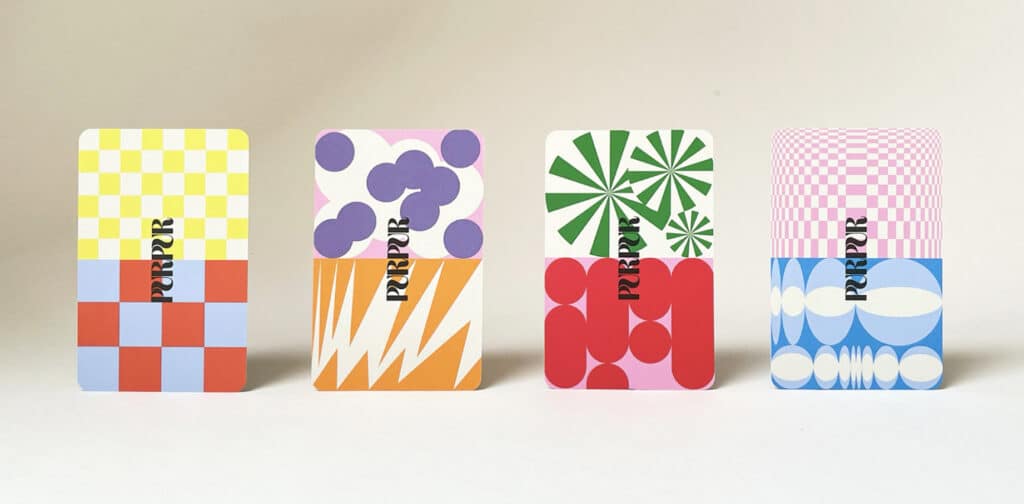
#13. Geometric Shapes
Geometric fonts, shapes, and compositions are making a sharp entrance in 2024. Designers and people alike seek refuge from ambiguity in the pristine angles and geometry of shapes.
Get inspired by reducing the world around you into rudimentary shapes. Something is soothing about looking at the world from a more simplified lens. Shapes of all sizes and colours appear in branding, packaging, and web design to usher in a bold and contemporary look.
Although this design trend isn’t suitable for all industries, it’s for projects that want a modern and advanced look.
#14. Accessible Color Combinations
Gone are the days of colour palettes chosen solely for aesthetics. 2024 ushers in the era of accessible colour combinations.
This means adopting palettes that meet the WCAG (Web Content Accessibility Guidelines) requirements, ensuring designs are readily visible to individuals with colour blindness. Designs will see more high-contrast pairings like yellow and blue or green and pink, ensuring information pops regardless of visual limitations.
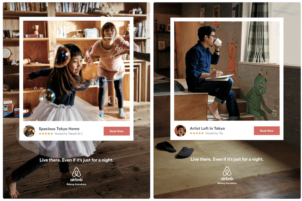
Airbnb’s 2023 “Live There” campaign used a warm and inviting colour palette of coral, ochre, and teal. They use high contrast between foreground and background elements, making the content readable for visually impaired people.
These complementary colours offer distinct contrast while maintaining a harmonious feel, ensuring accessibility without sacrificing the campaign’s vibrant and welcoming aesthetic.
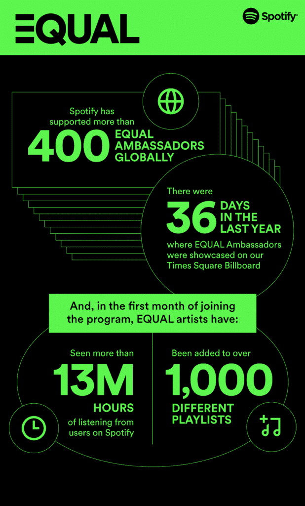
On the other hand, Spotify’s “Equal” initiative promotes gender equality in music. Its branding uses contrasting colours, ensuring accessibility for all users. Spotify designers also avoid relying solely on colour to convey information, using additional cues like iconography and text descriptions.
But accessibility doesn’t end with desktop screens. This trend considers responsiveness, with designers crafting palettes that adapt seamlessly to mobile screens, light and dark modes, and different zoom levels. This ensures information remains clear and legible across diverse platforms and user preferences.
#15. AI-Enhanced Design Practices
Think AI will steal your design mojo? Think again! In 2024, AI will become a designer’s ultimate wingman, offering a helping hand (or, instead, a processing unit) to streamline your workflow and unleash your creativity.
Imagine software that understands your design intent, suggesting colour palettes based on your target audience or even whipping up mood boards inspired by your favourite artists. The future of AI lies in augmenting your creative process, not replacing it.
Tools like automated image resizing, background removal, and color correction will free you from tedious tasks, letting you focus on the big picture: conception, ideation, and the human touch that makes sound design great.
Adobe Sensei, for example, is a great AI sidekick for designers. It is powered by machine learning and built to elevate your creative flow. It speeds up tasks, personalizes experiences, and unlocks possibilities you never imagined, all within your favourite Adobe apps.
To make it easier for you to integrate these trends into your projects, I’ve created a trend integration checklist. Use this checklist to ensure you’re leveraging the latest trends effectively and thoughtfully.
Lamphills Trend Integration Checklist
Bottom Line
There you have it! 15 of the best graphic design trends for 2024. Get ahead of the curve and consider incorporating these trends into your work. You can get back to this guide to experiment with new styles. Feel free to share it with your designer friends or clients to inspire them.
Similar Articles
- 2024 Digital Marketing Trends: What You Need to Know
- Emoji Marketing Trends: How I Use Emojis in Digital Marketing Campaigns in 2024
